Get Lost | Greenspace
Editorial Design Brand Identity Creative Direction Photography
Adobe InDesign
Adobe Illustrator
Adobe Photoshop
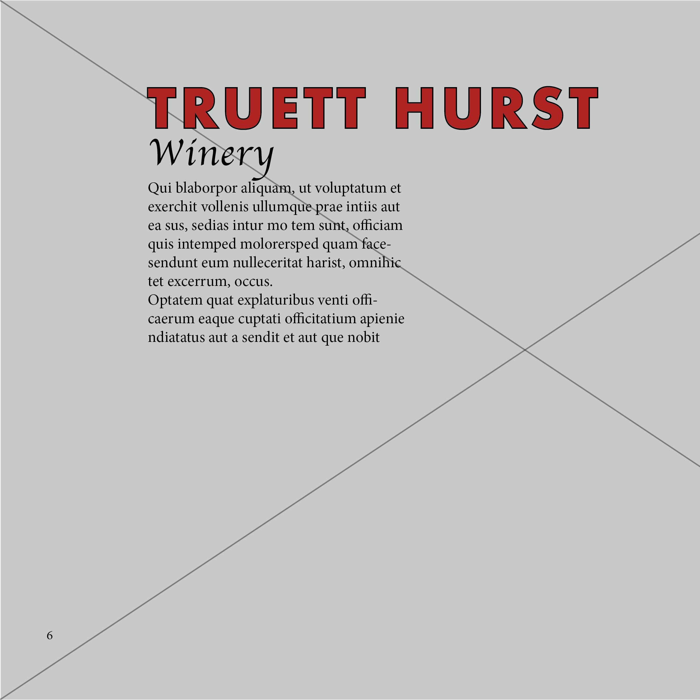
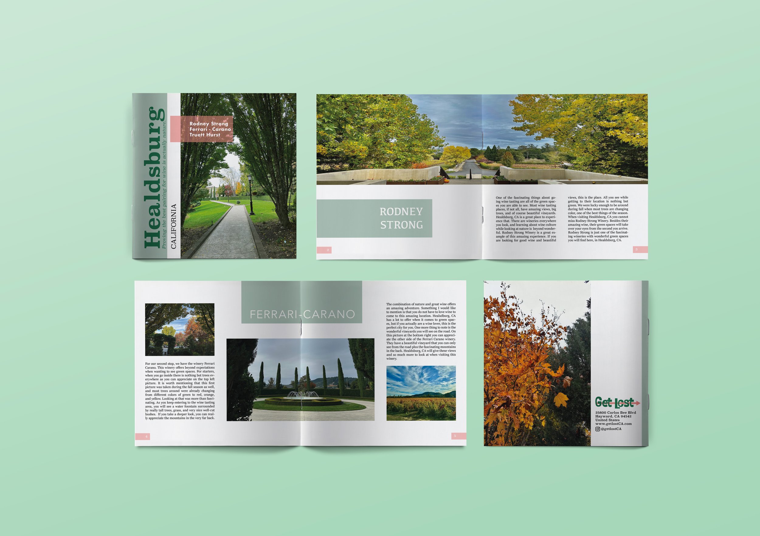
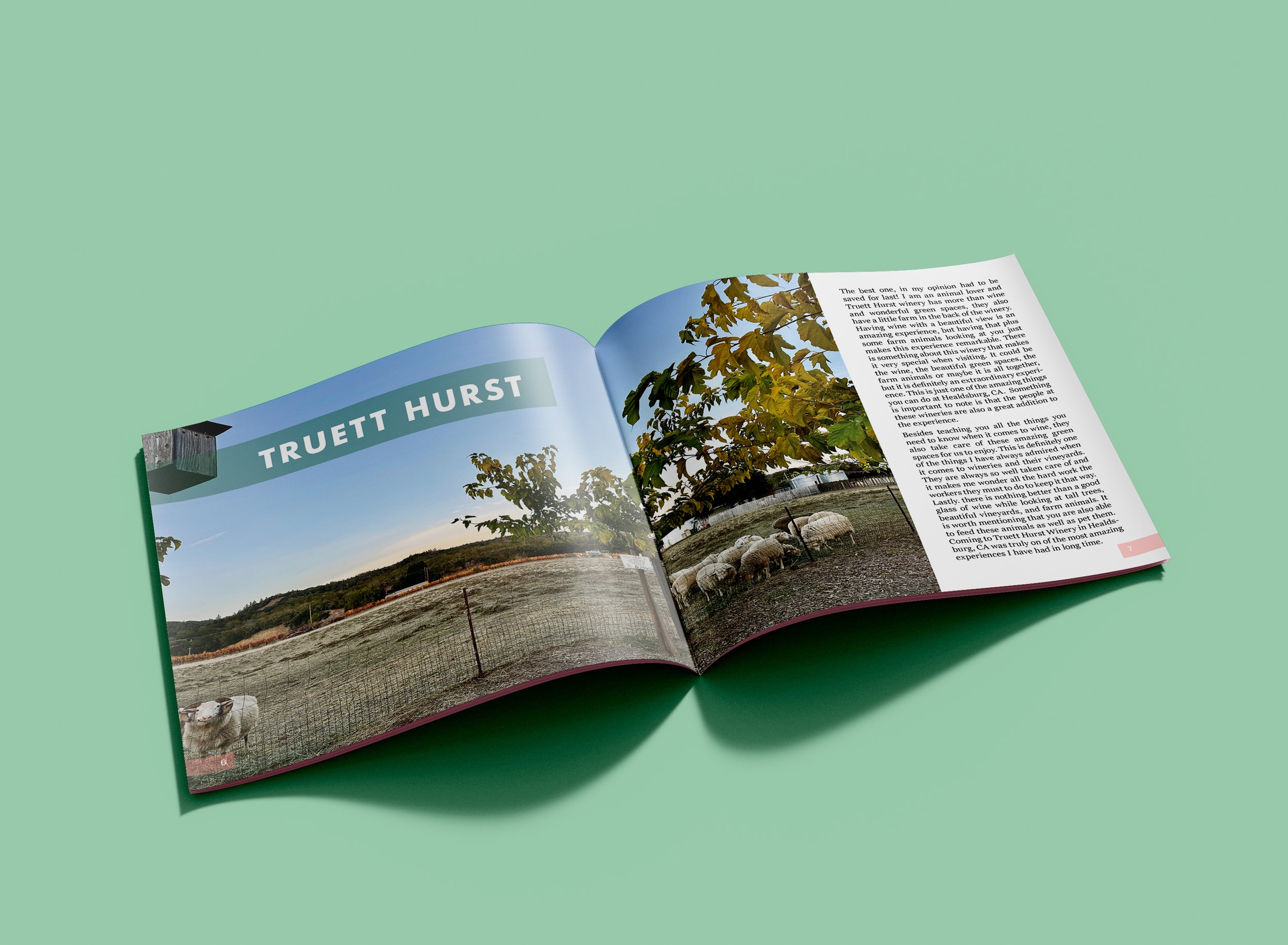
Get Lost is a brand built around the idea that beauty is everywhere, you just have to be willing to wander. This booklet is the first in a series, taking readers through three wineries in Sonoma County: Rodney Strong, Ferrari-Carano, and Truett Hurst. Through photography and written reflections, it captures the atmosphere, landscape, and artistry of each place.
The Get Lost Identity
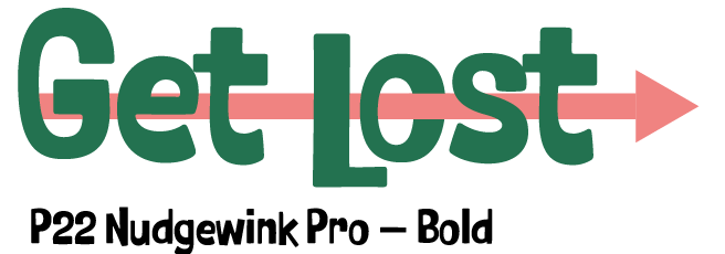
The Get Lost logo is built around a simple idea: the arrow that guides you through the word is the same one that points you somewhere new. The font was chosen for its warmth and personality, sturdy enough to feel trustworthy, and playful enough to feel like an adventure.
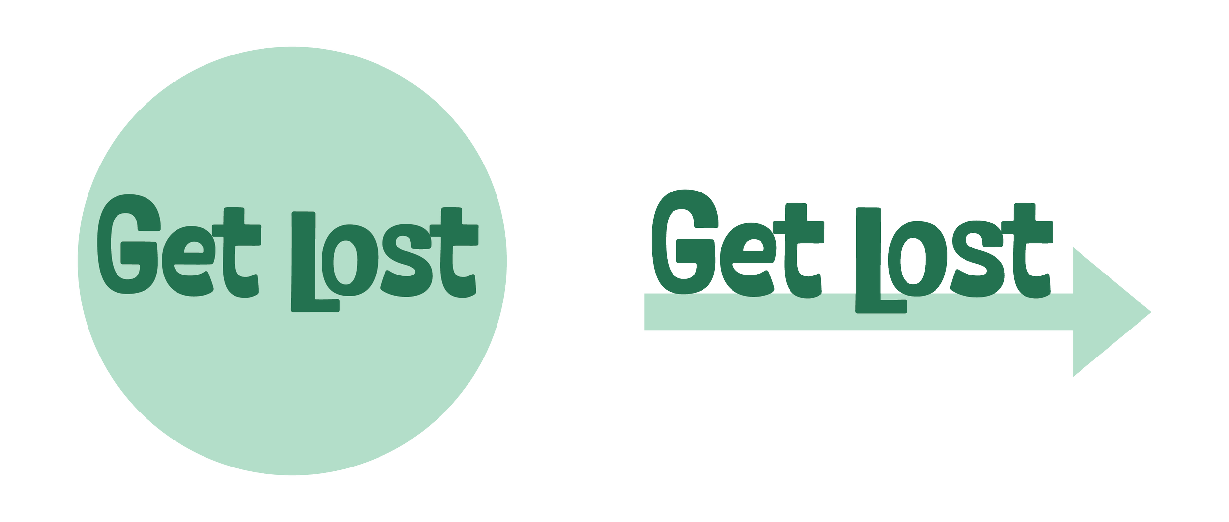

Logotype
Copy
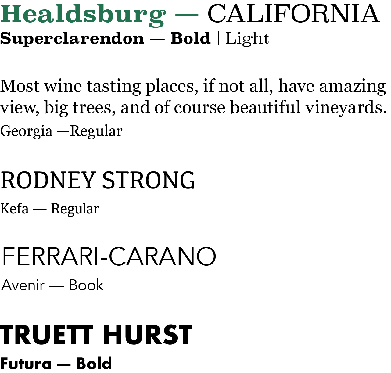
Each winery name uses a typeface that reflects its own identity, giving every section a distinct personality within the same system.

The palette was kept minimal and consistent throughout. Dark green anchors the brand in nature and gives it a sense of depth. Dark salmon works as the secondary color, adding warmth and energy without taking over. The mint and light salmon appear only as accents, used sparingly to add softness and balance. Together the four colors feel fresh and organic, which reflects the whole idea behind Get Lost, finding beauty in natural, everyday spaces.

The Process