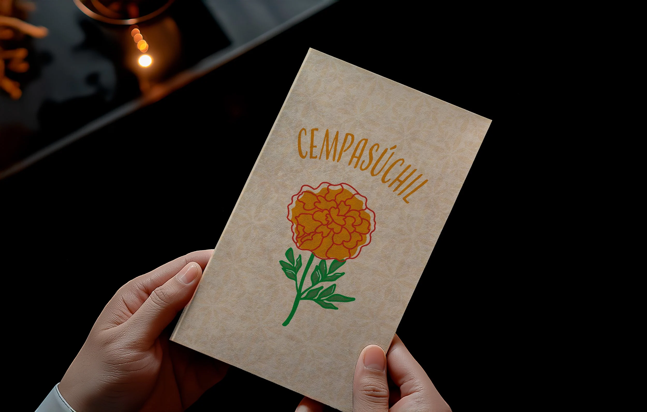
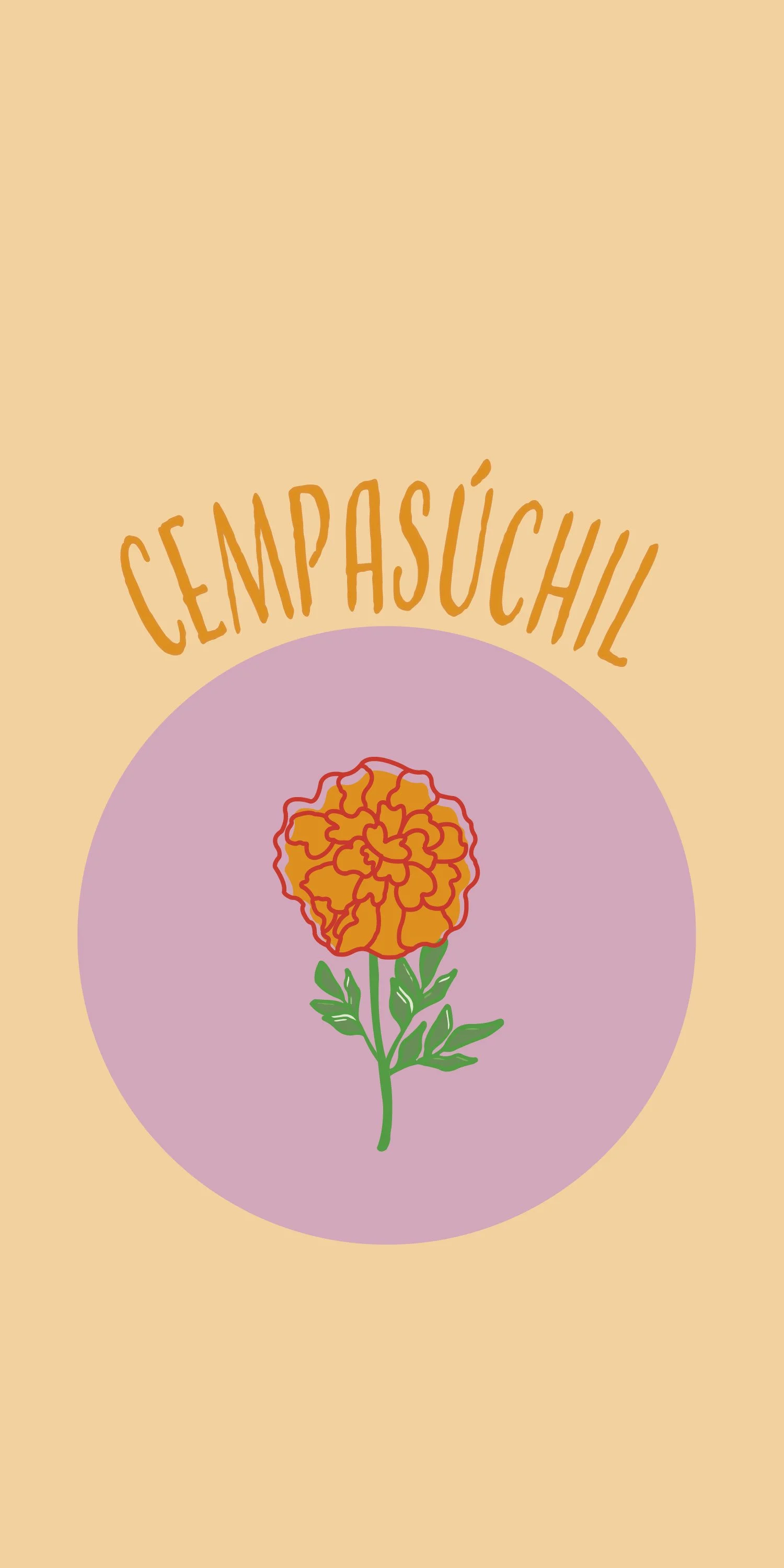
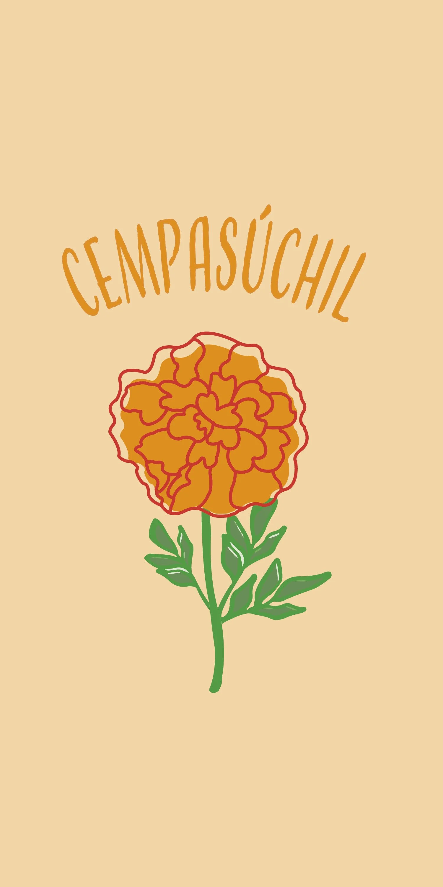
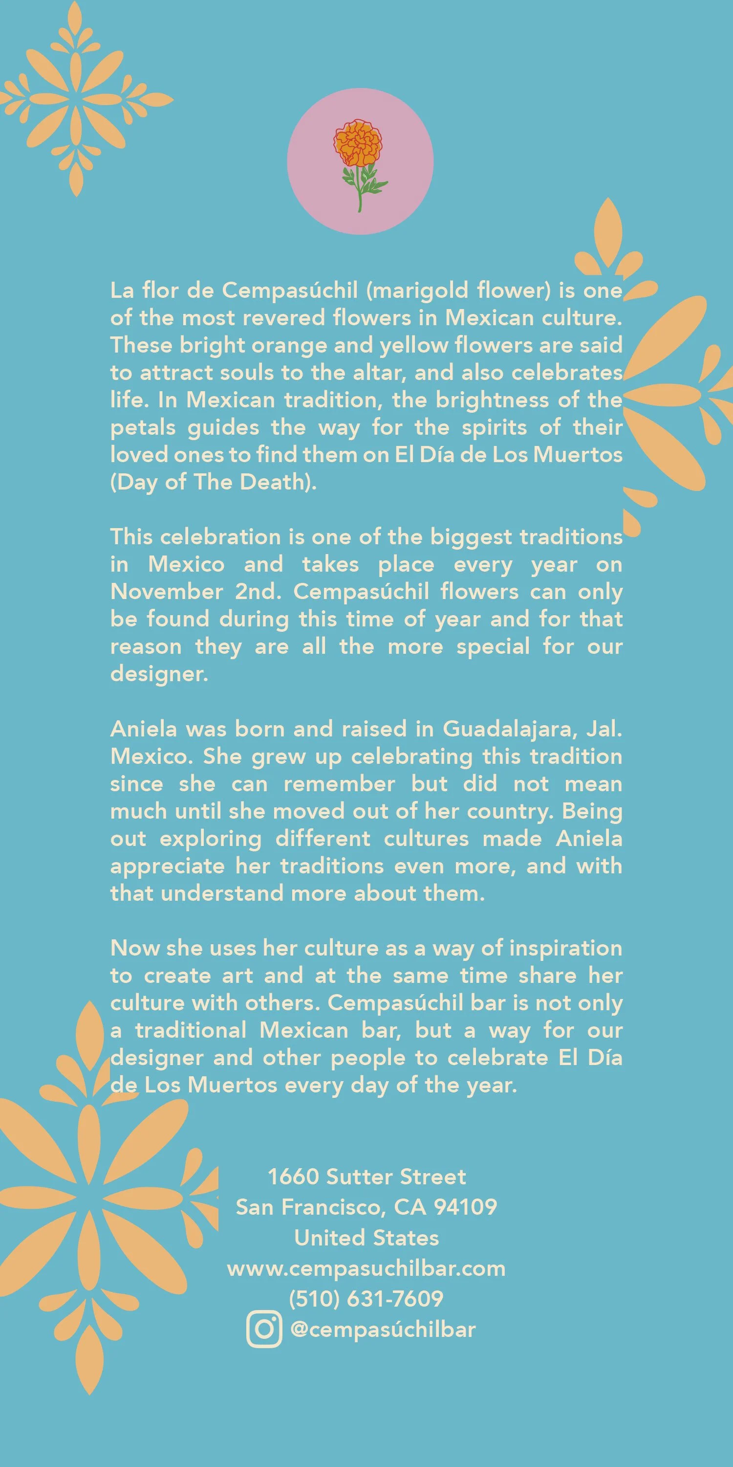
Campasúchil
Brand Identity Menu Design Illustration
Adobe Illustrator
Adobe InDesign
Adobe Photoshop
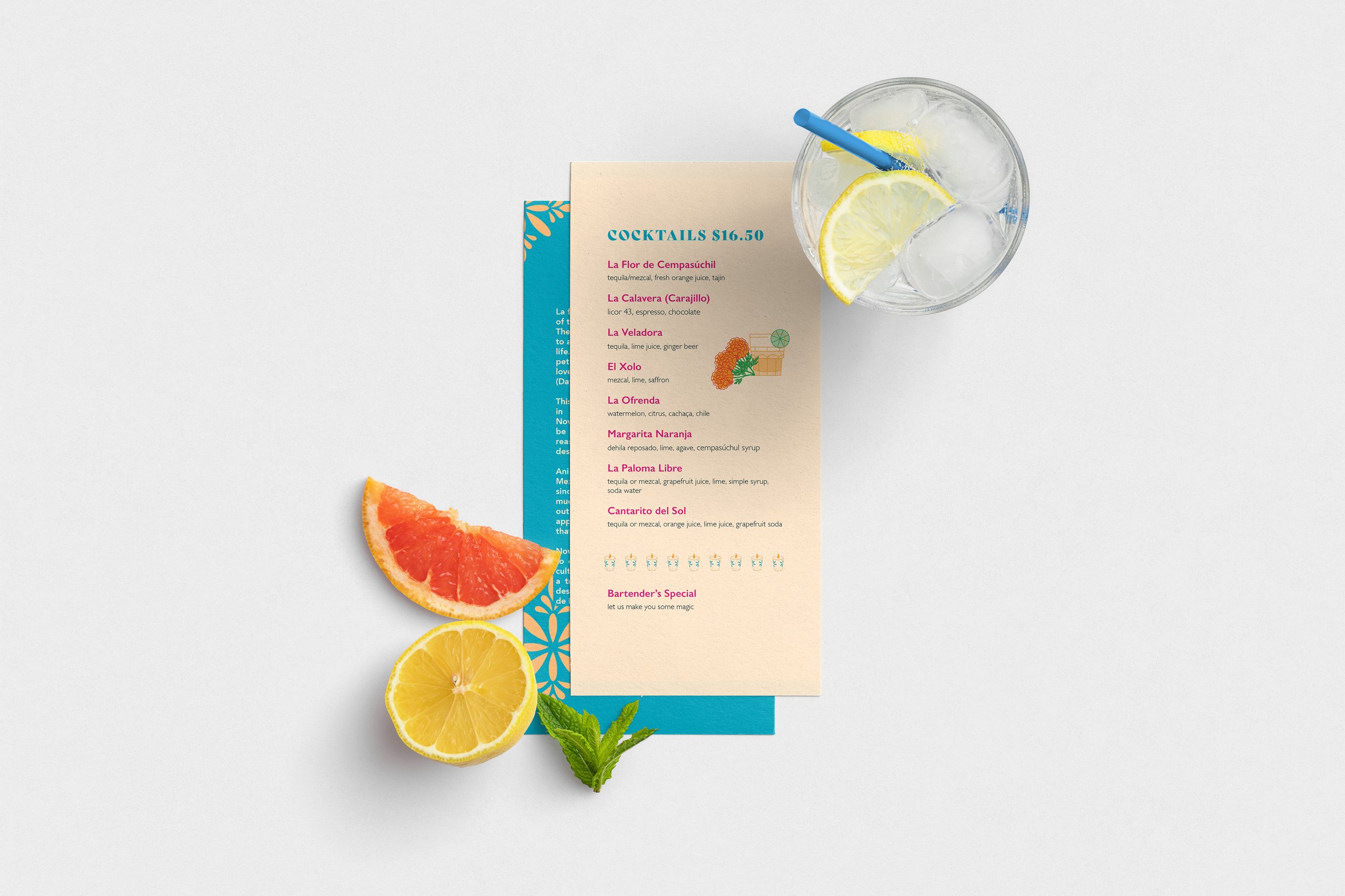
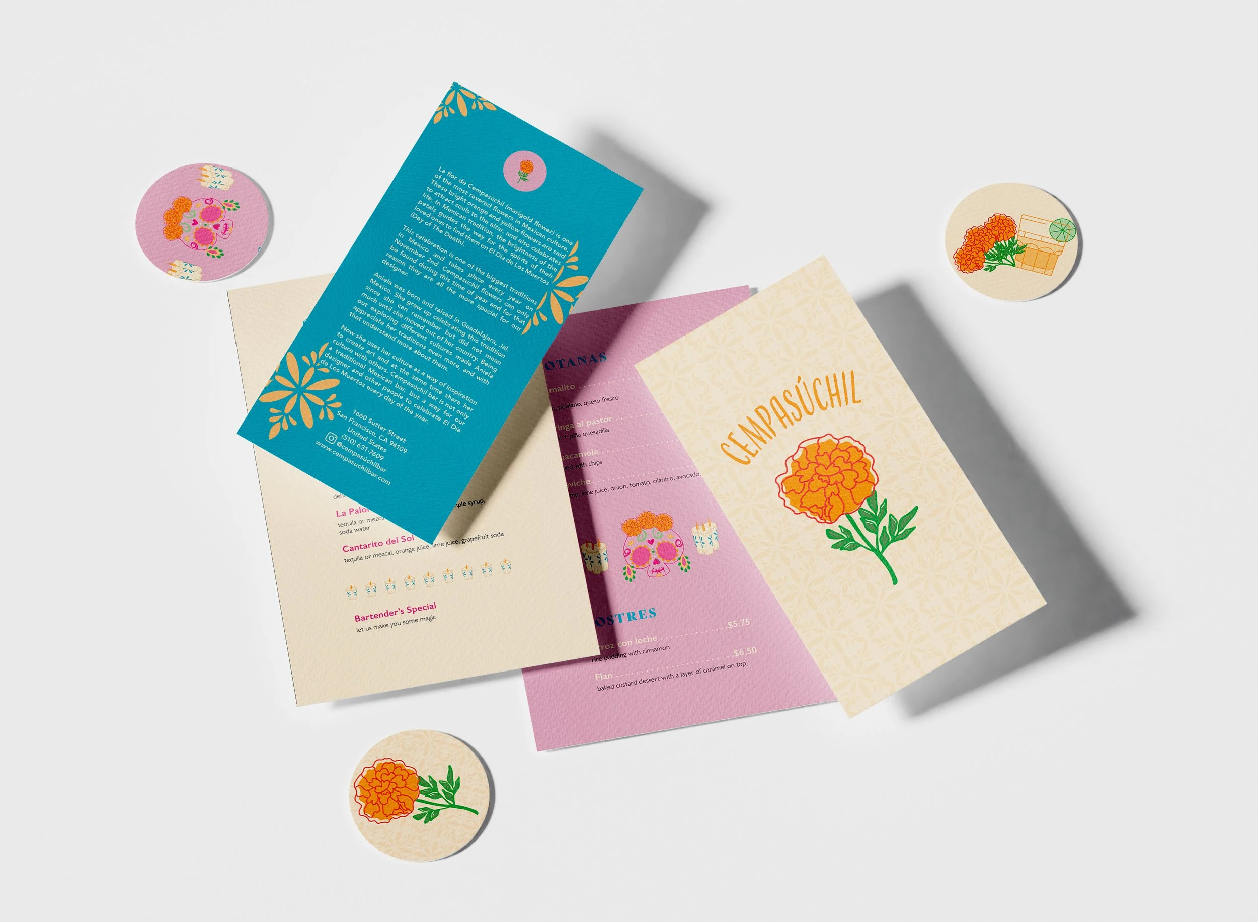
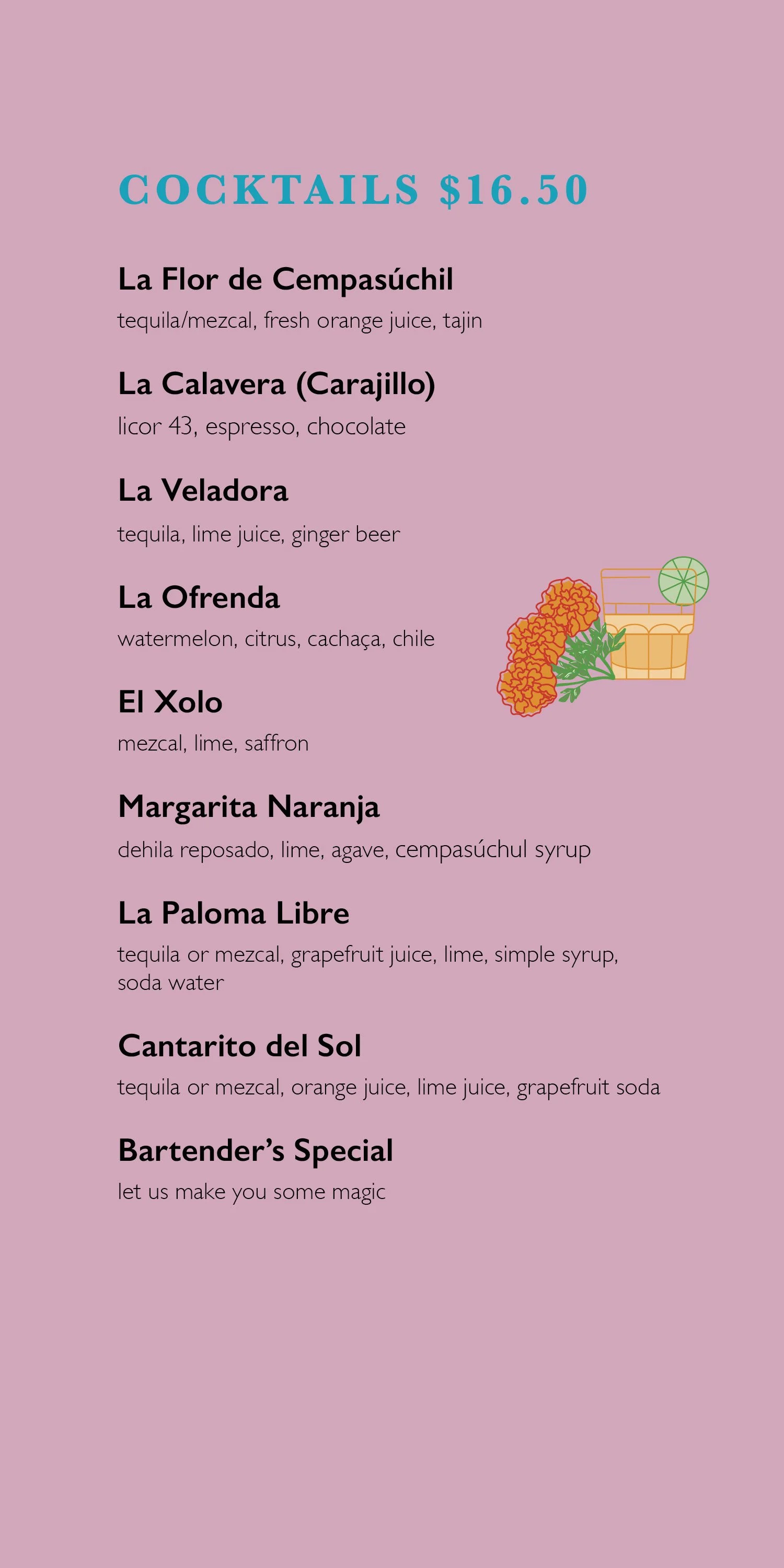
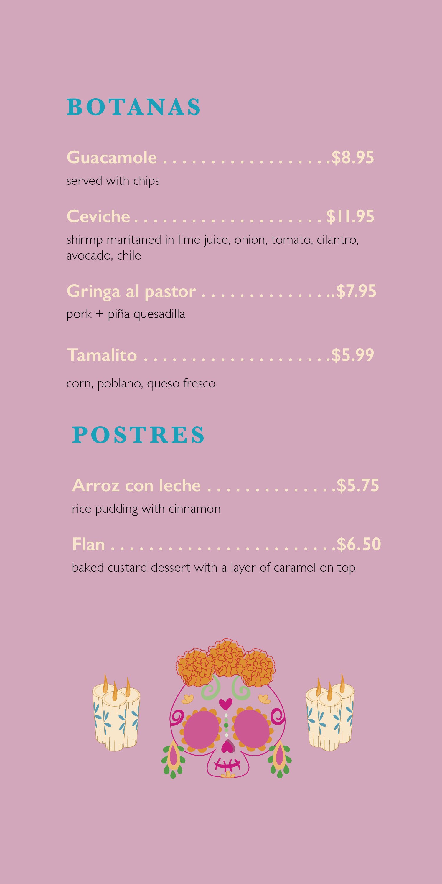
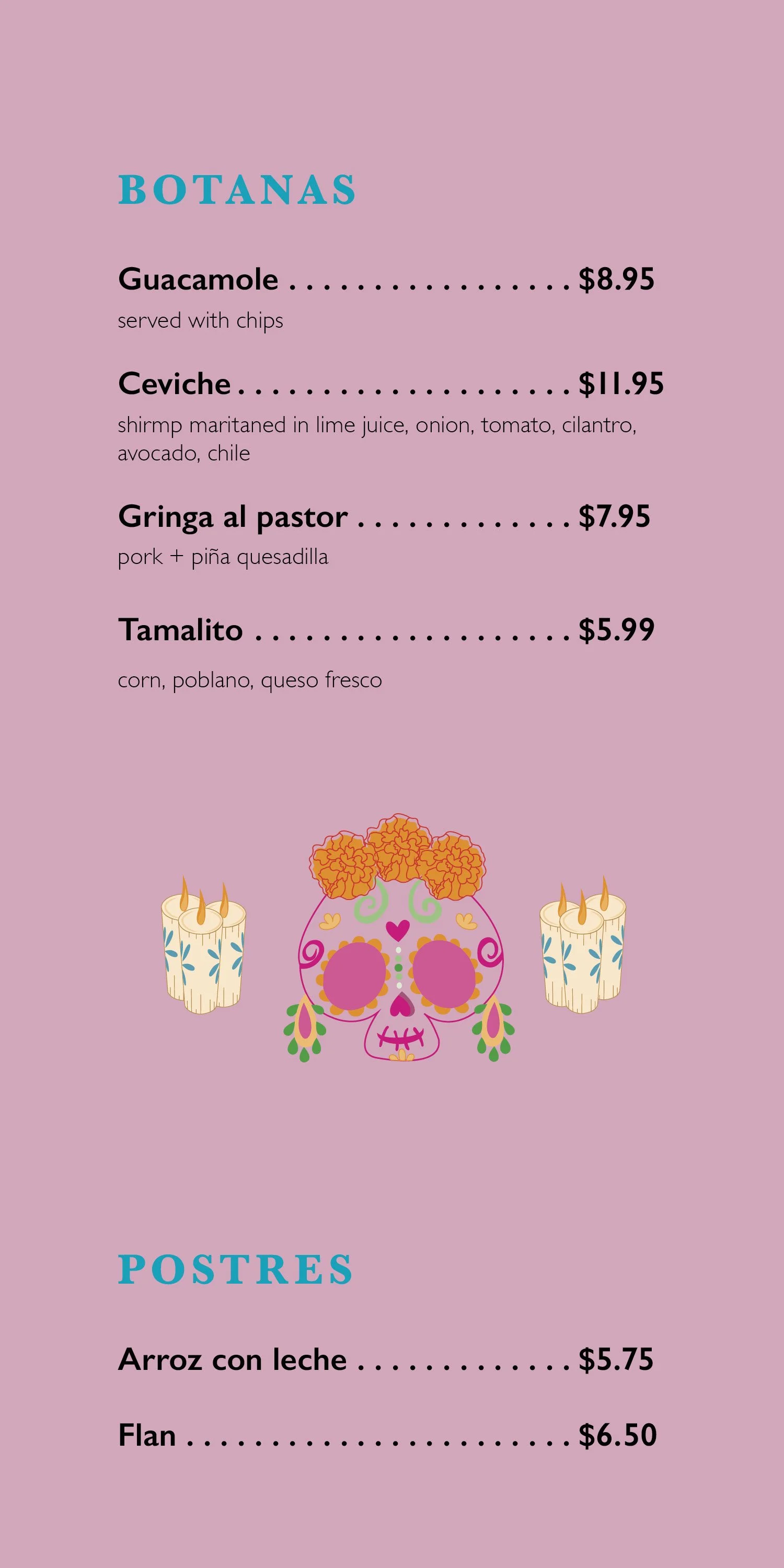
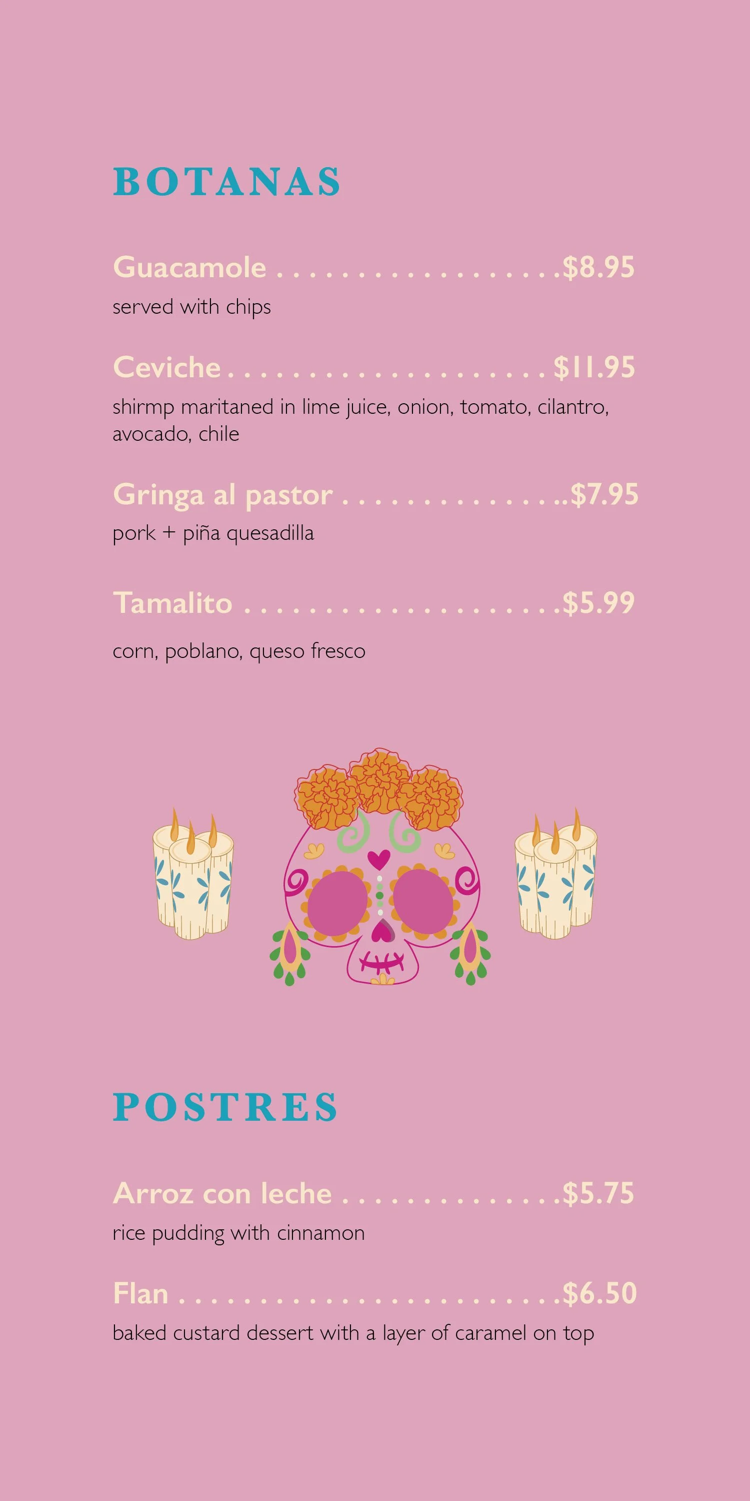
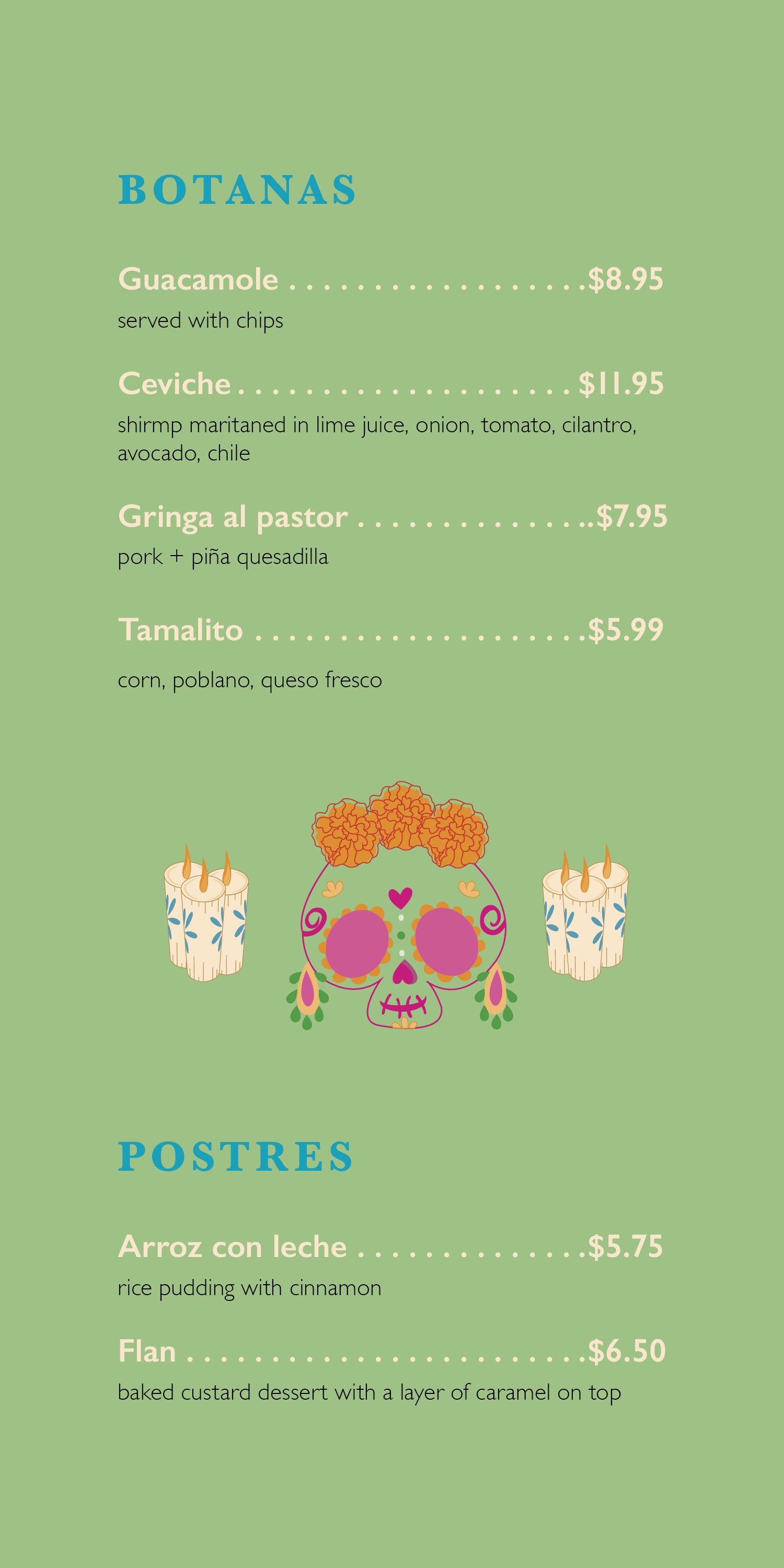
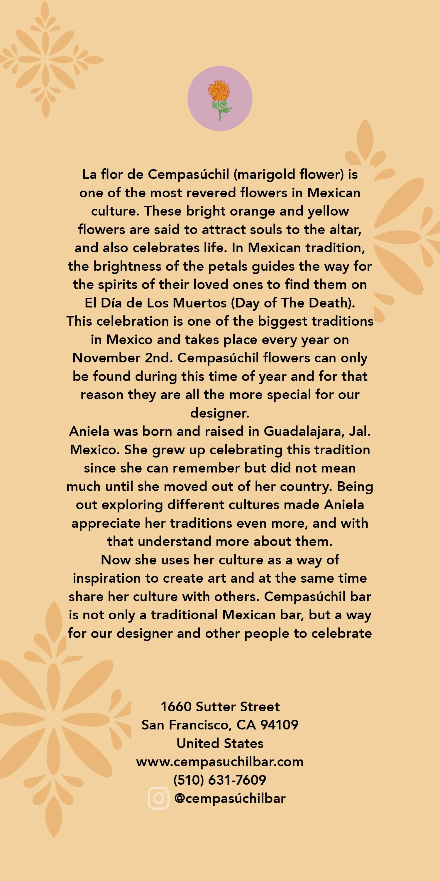
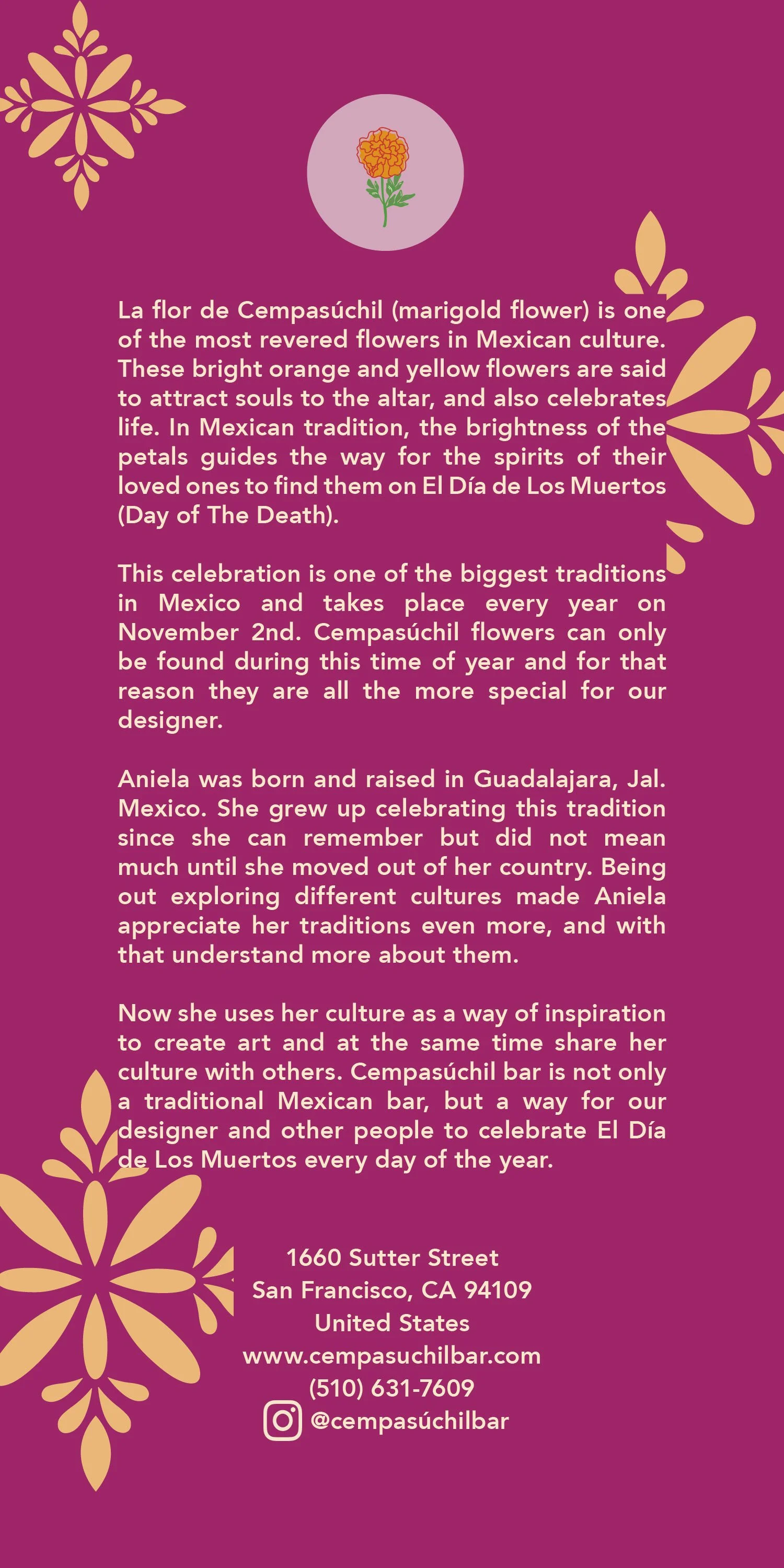
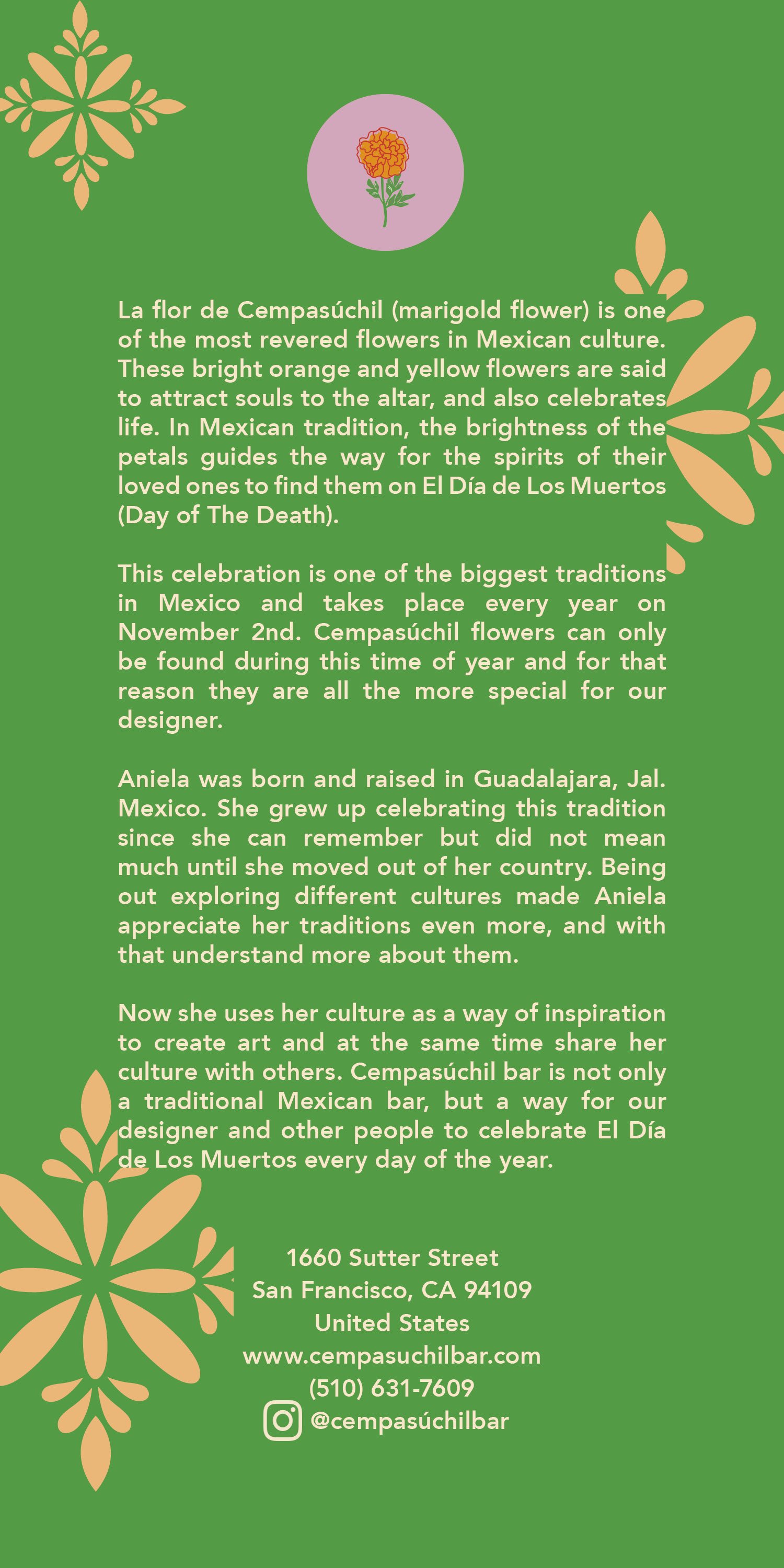
Cempasúchil is bar themed around the Mexican holiday Día de los Muertos. The goal was to elevate traditional symbols, such as the marigold and calaveras, into a sophisticated brand identity that avoids visual clichés while maintaining deep cultural roots.

Logotype

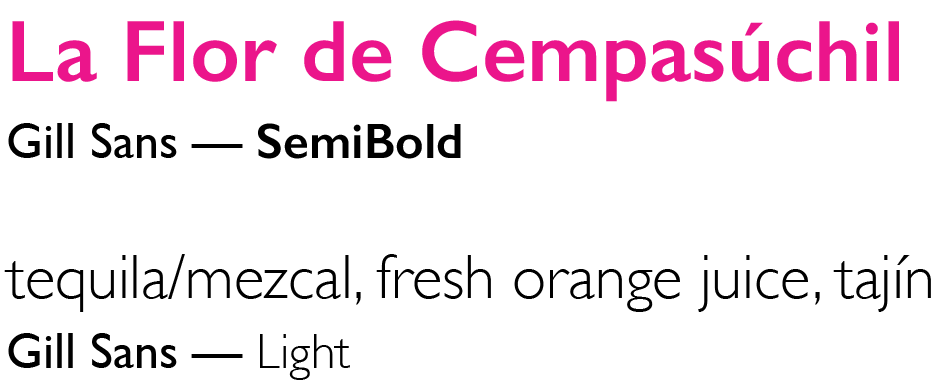
Copy Headers

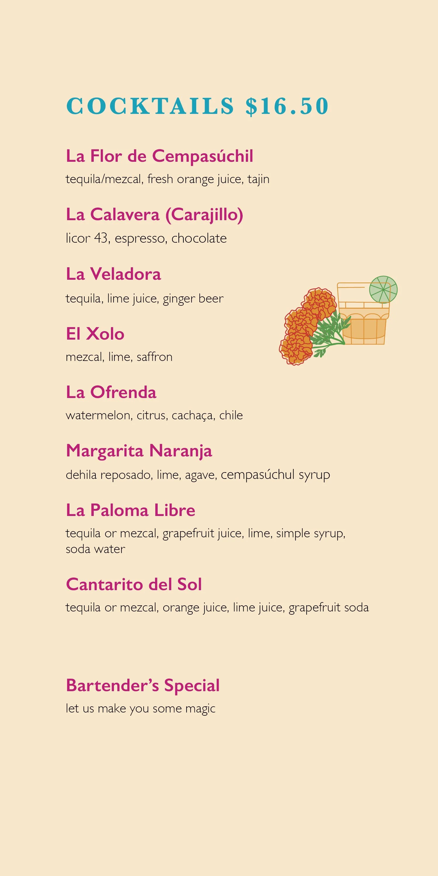
Copy Cocktail List
Copy Back of Menu


The colors are a reflection of the vibrant energy found in Día de los Muertos tradition and Mexican culture.
Primary: Orange and Pink represent the traditional cempasúchil flowers and papel picado.
Balance: Green and Blue add an organic touch and contrast to the patterns.
Accents: Red is used strictly for small illustrative details for the logo.
Specific tints were also used within these colors to add depth to the illustrations and menu layouts without breaking the brand's consistency.

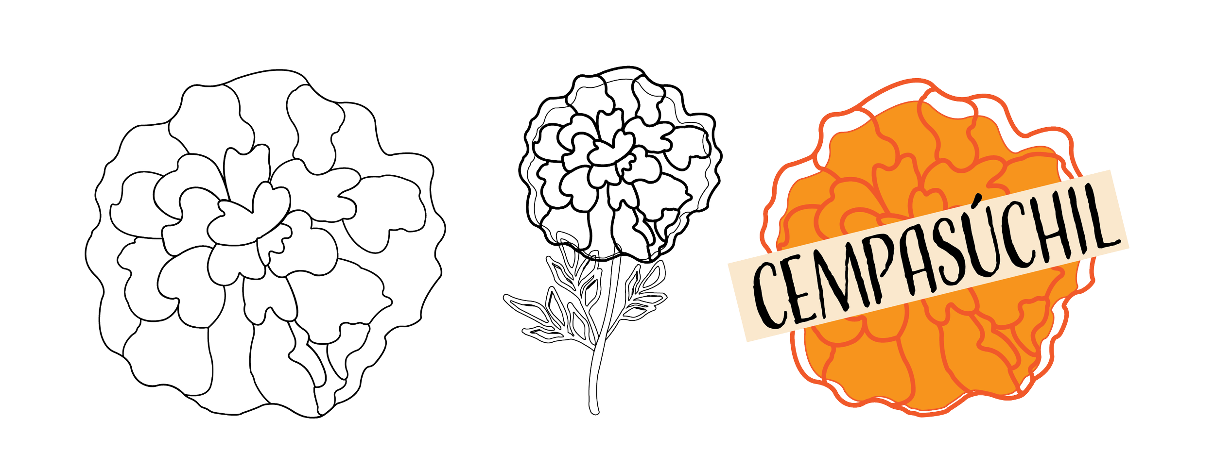
Illustrations
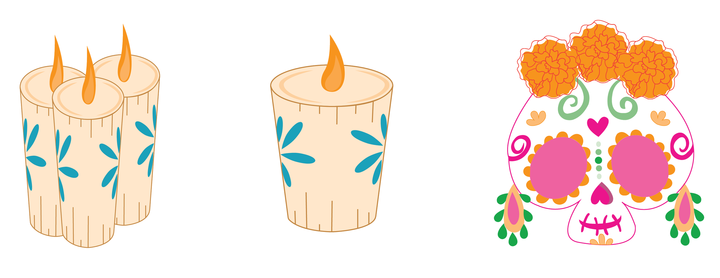
A series of illustrations was developed to create a unique, tactile feel for the Cempasúchil identity. These elements bridge the gap between traditional Mexican folk art and modern digital design.
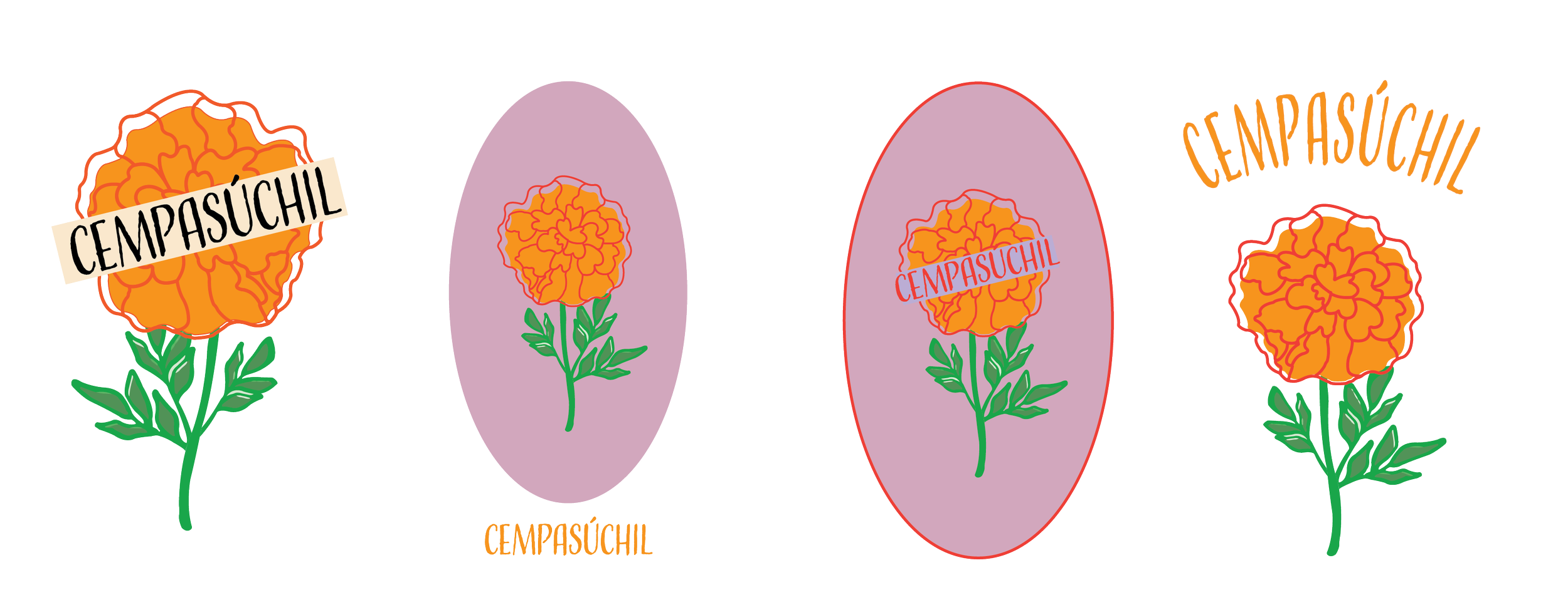
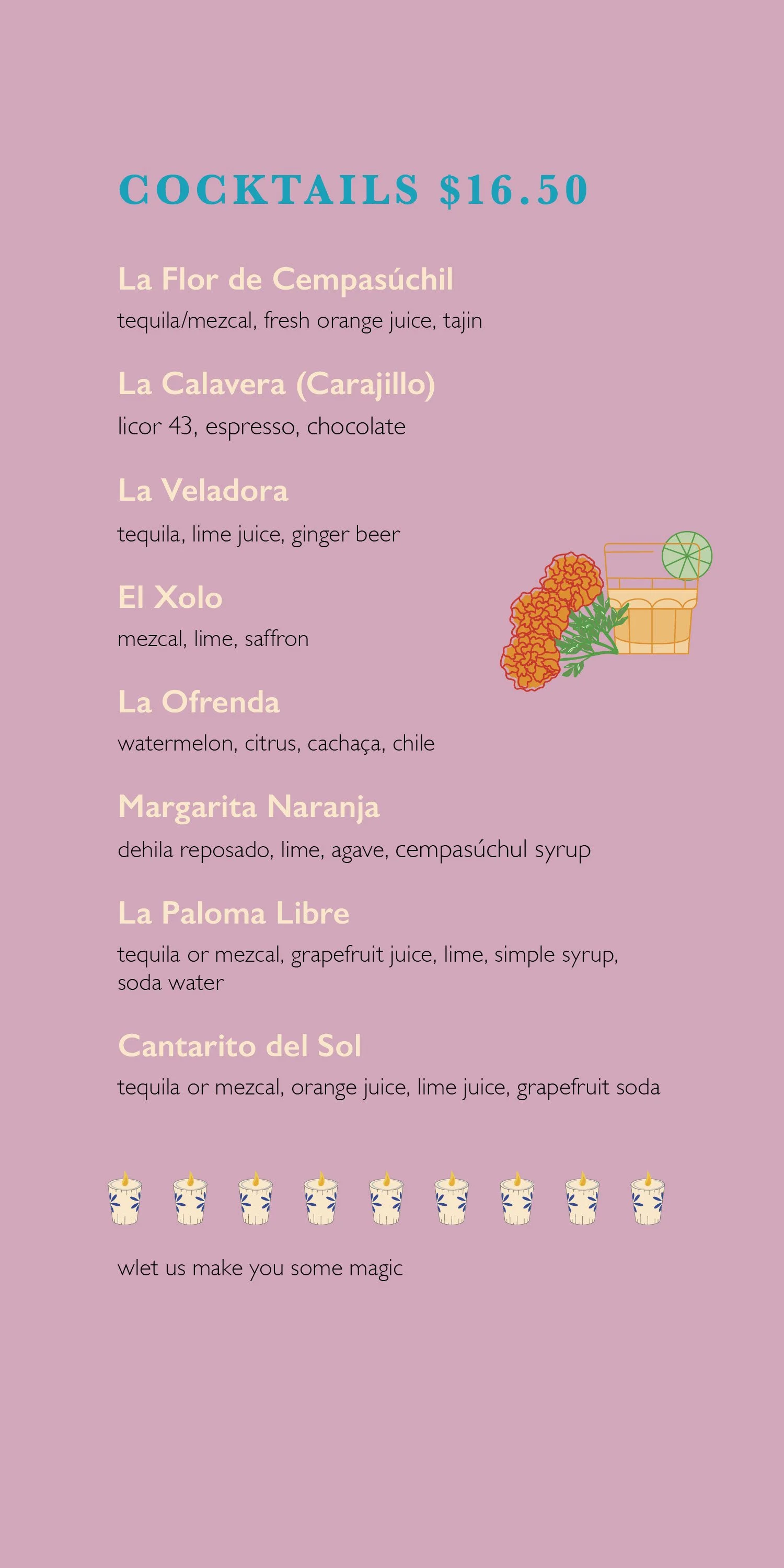
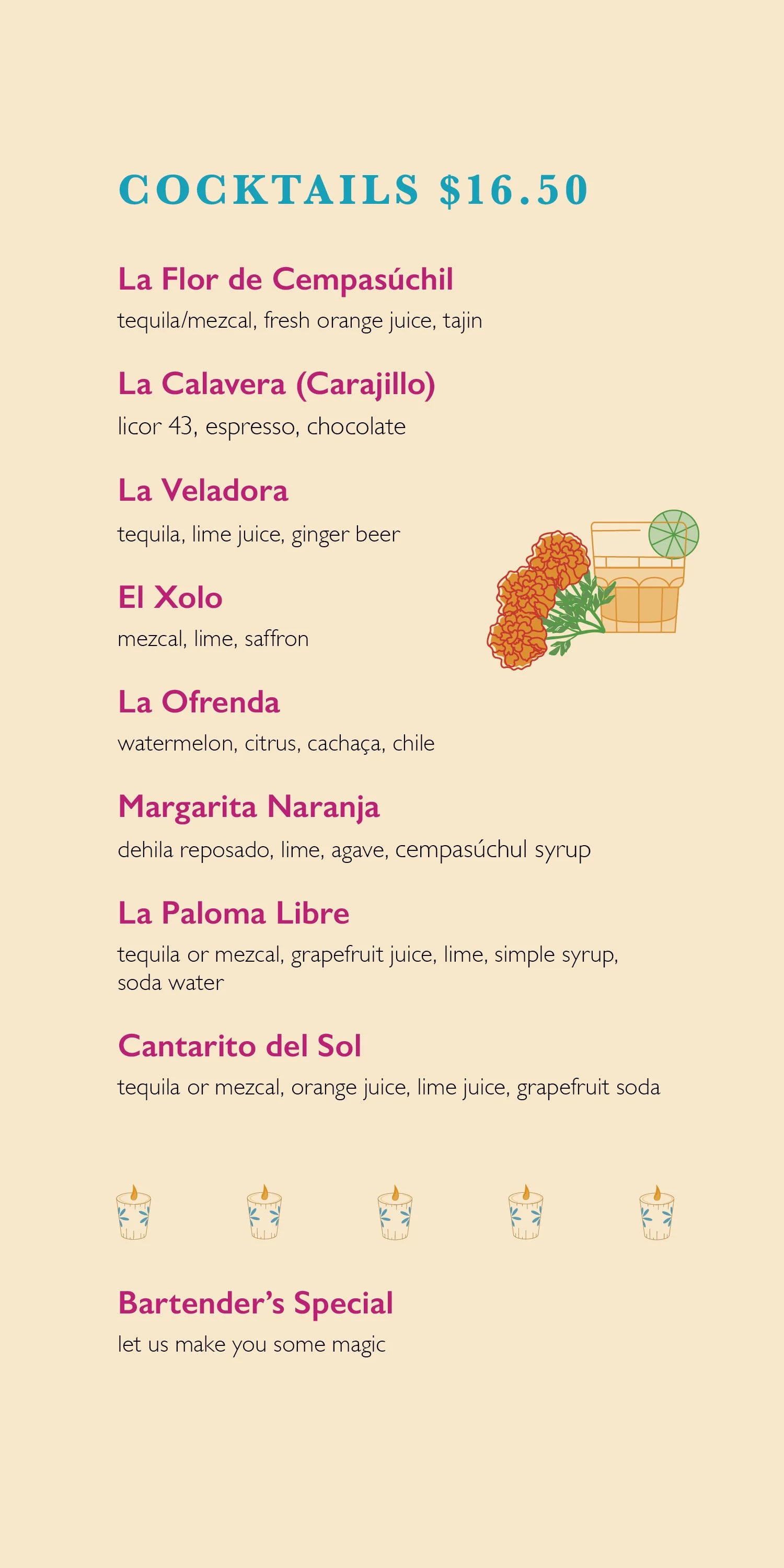
Iteration & Refinement
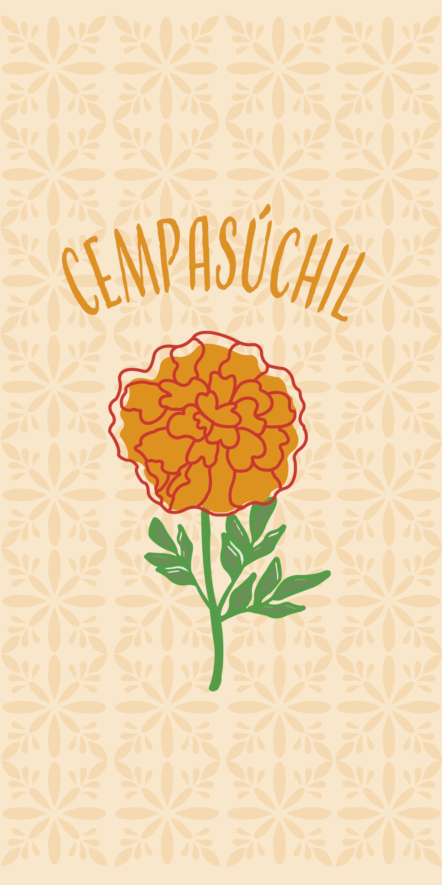
Cempasúchil Menu