Delicias de Michoacán
Brand Identity Illustration Print Production
Adobe Illustrator
Adobe InDesign
Adobe Photoshop
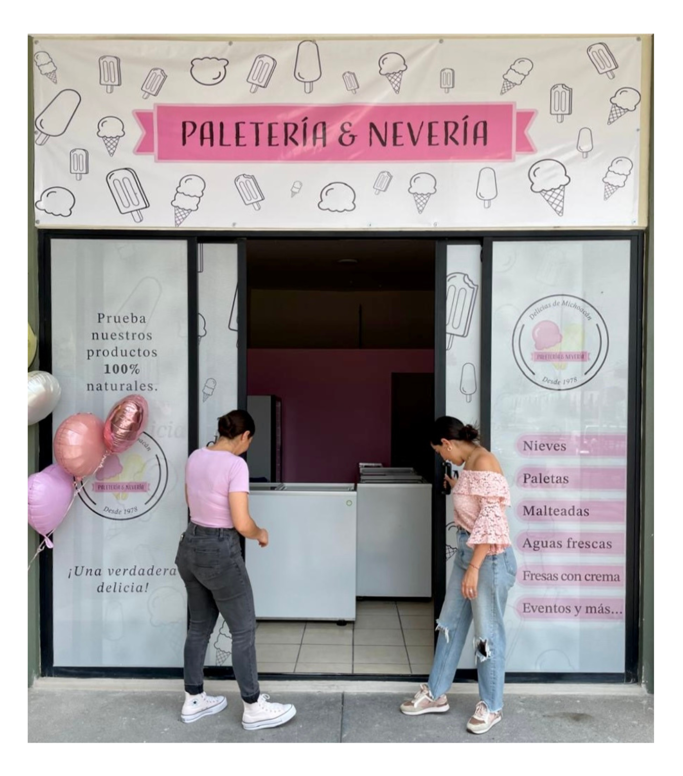
The goal was to create a brand identity for a traditional Mexican ice cream shop that felt both modern and nostalgic. The visual system needed to be playful enough to attract families while staying professional enough to work across a variety of physical marketing materials, from small invitations to large-scale store signage.

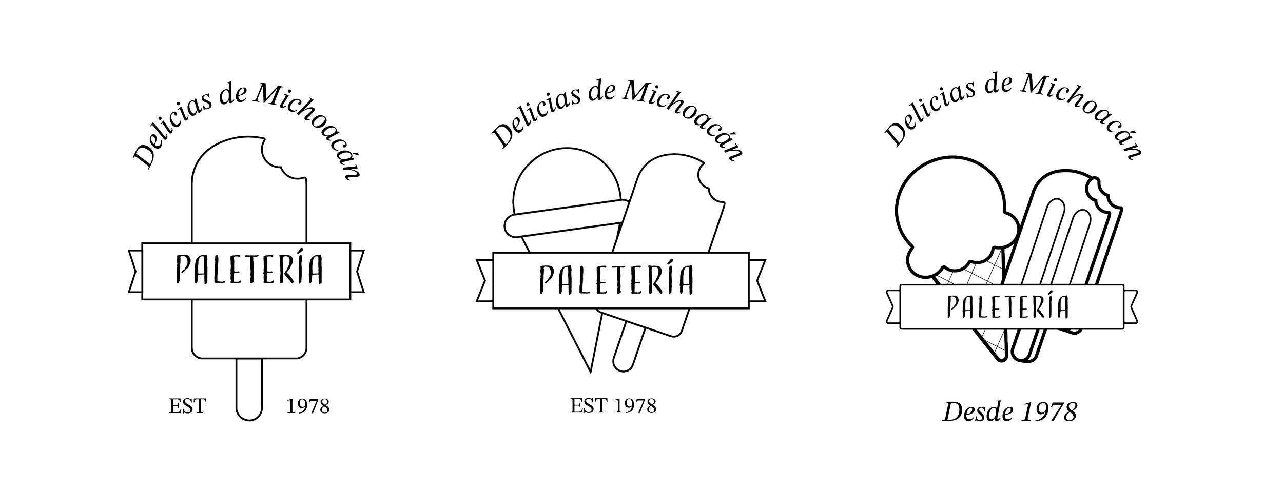
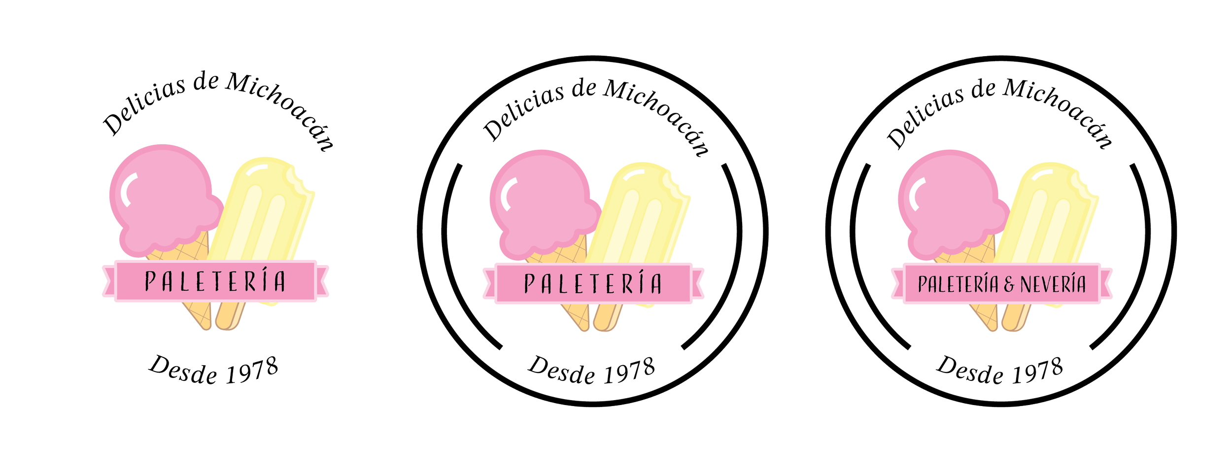
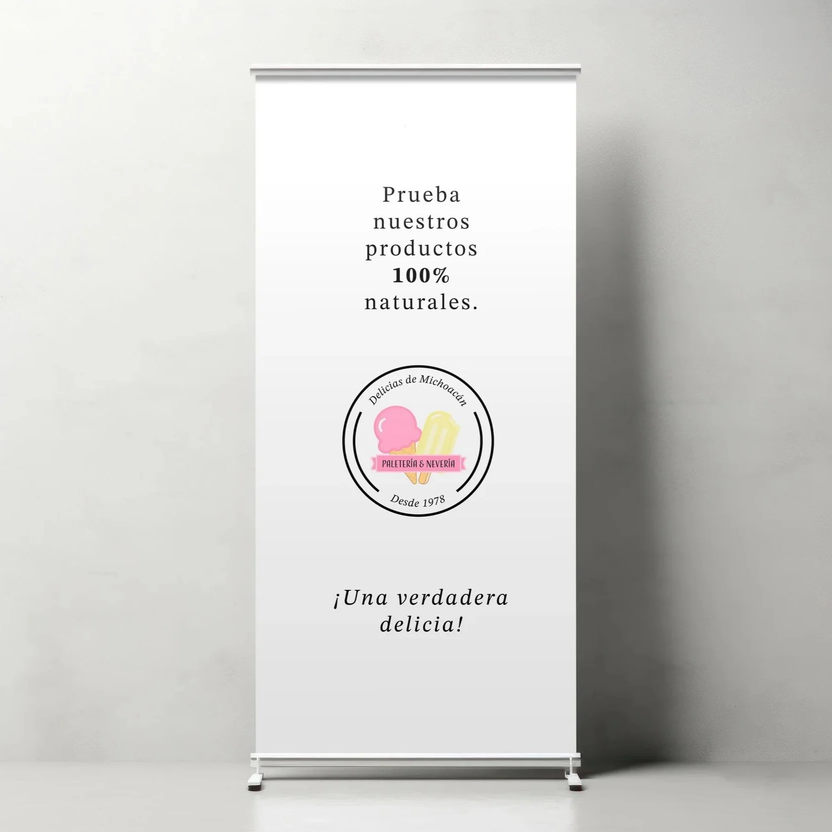
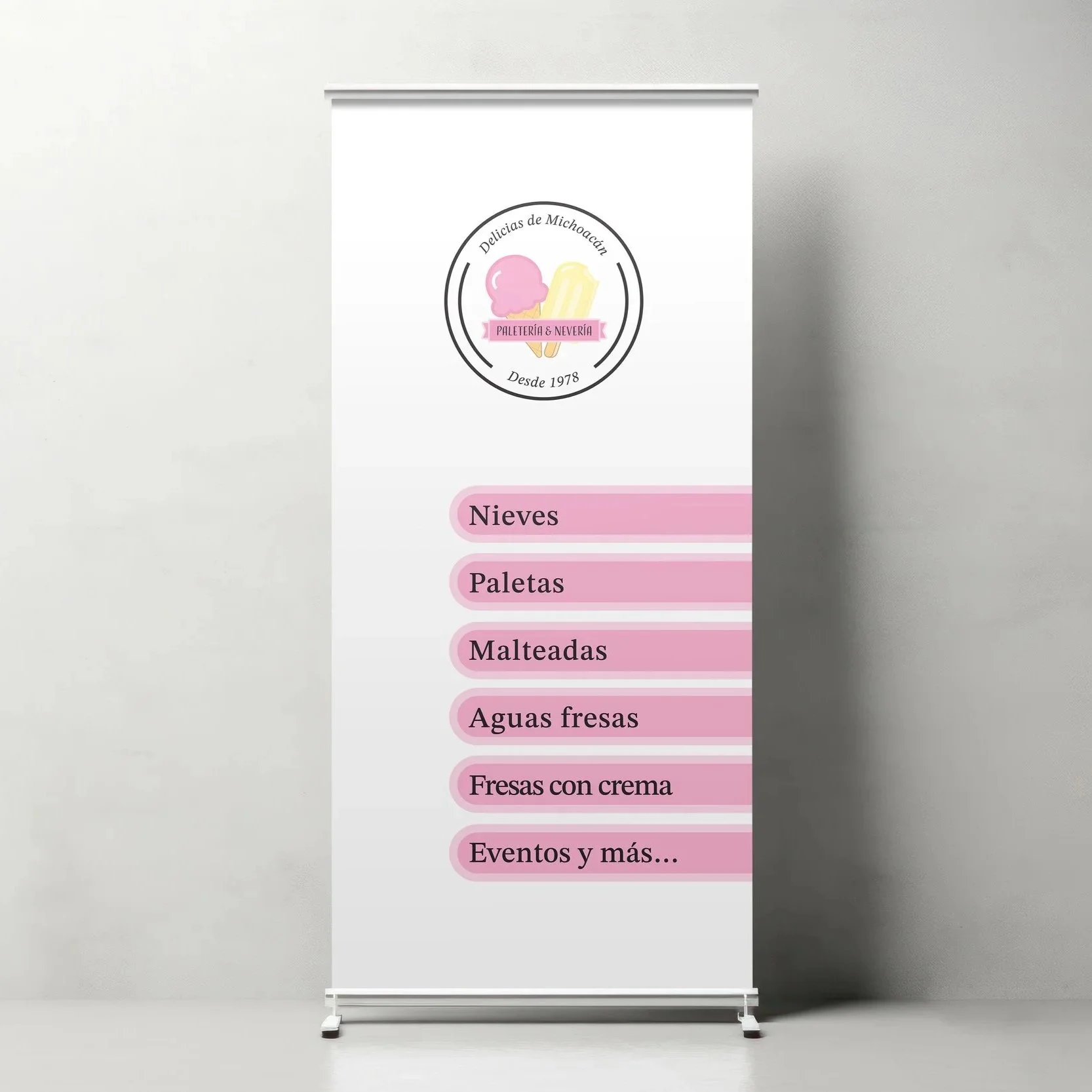
The logo was built around a circular badge shape, a classic, timeless format that felt right for a family shop that has been around since 1978. The ice cream and paleta illustration was sketched by hand first, then refined in Illustrator. The client wanted something playful and cute, so every element, the banner, the curves, the illustrated treats, was designed to feel warm and welcoming.
Logotype
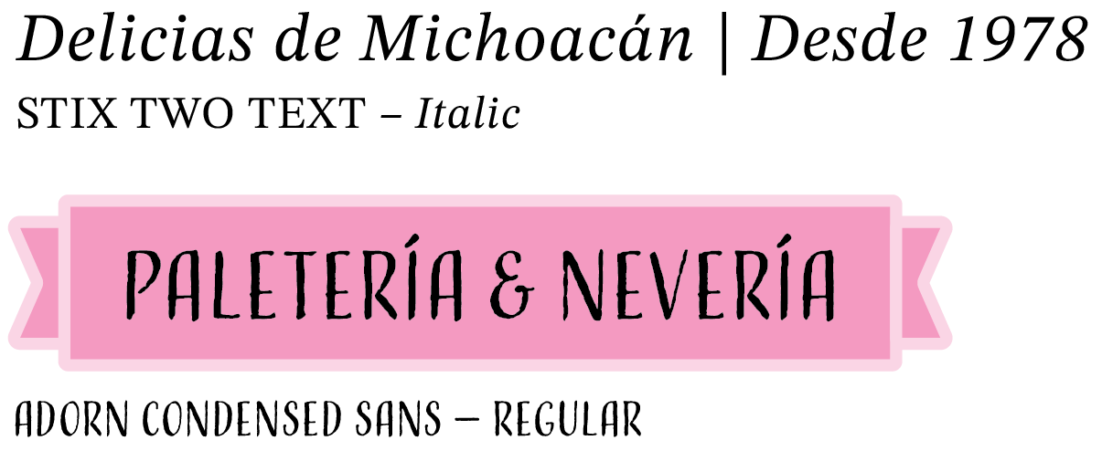
Copy

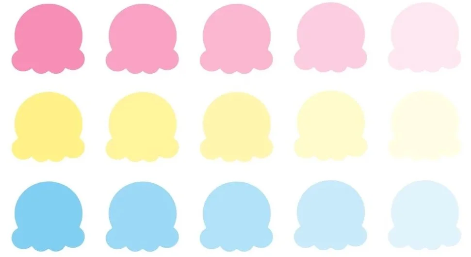
The color palette is bright and playful, pink as the main color, yellow as the secondary, and a touch of sky blue as an accent. Each color comes with four tints, which gives enough variety to work across everything from small invitations to large storefront decals while keeping the brand consistent.
Primary color: Petal Pink
Secondary: Soft Yellow
Accent: Sky Blue
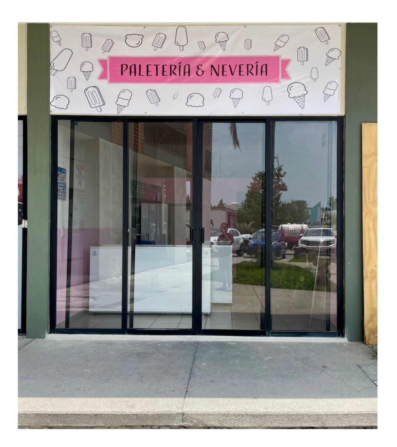
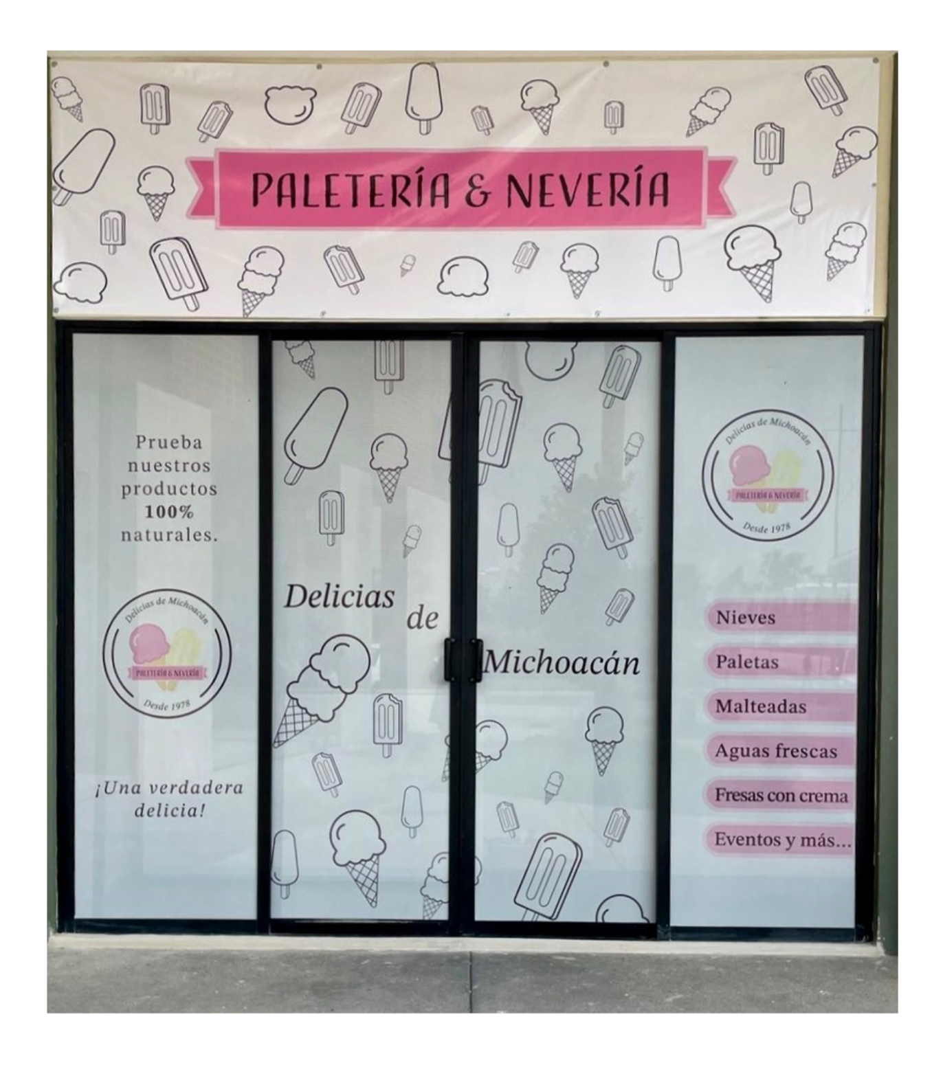
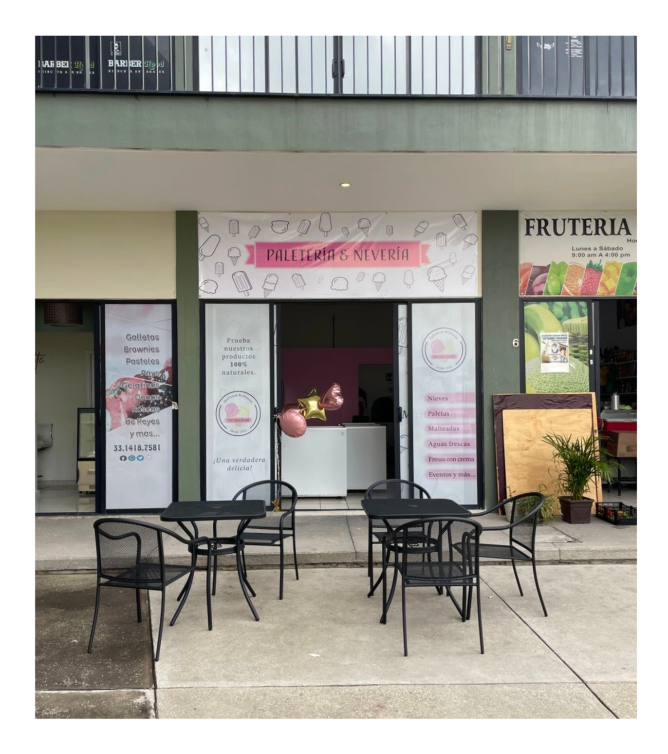
Environmental Graphics
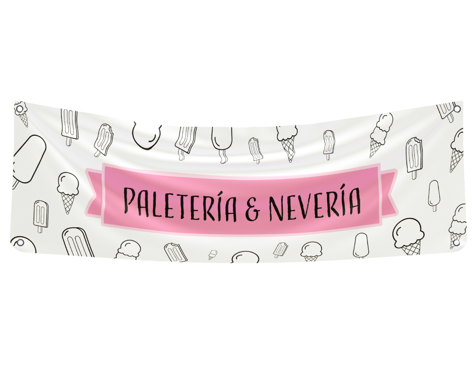
Large-format vinyl decals for the shop's physical space.

Marketing Materials
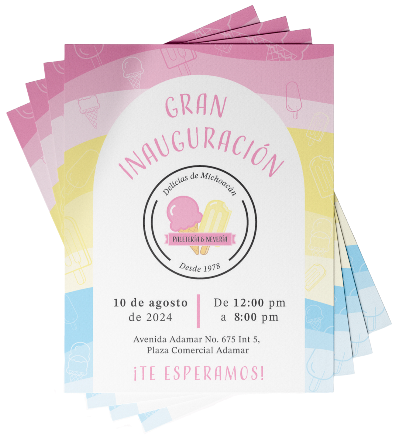
To bridge the gap between digital presence and the physical storefront, custom posters and invitations were created. These assets maintain visual consistency while serving as functional tools to invite the community into the shop.