El Alebrije
Brand Identity Illustration Packaging Design
Adobe Illustrator
Adobe Photoshop
Procreate
Most traditional Tequila and Mezcal brands rely on rustic, vintage aesthetics. The goal for El Alebrije was to break through the crowded spirits market by creating a brand that honors the deep cultural roots of Alebrijes while appealing to a modern, high-end consumer. The identity needed to feel "magical" yet clean enough for premium retail shelving.
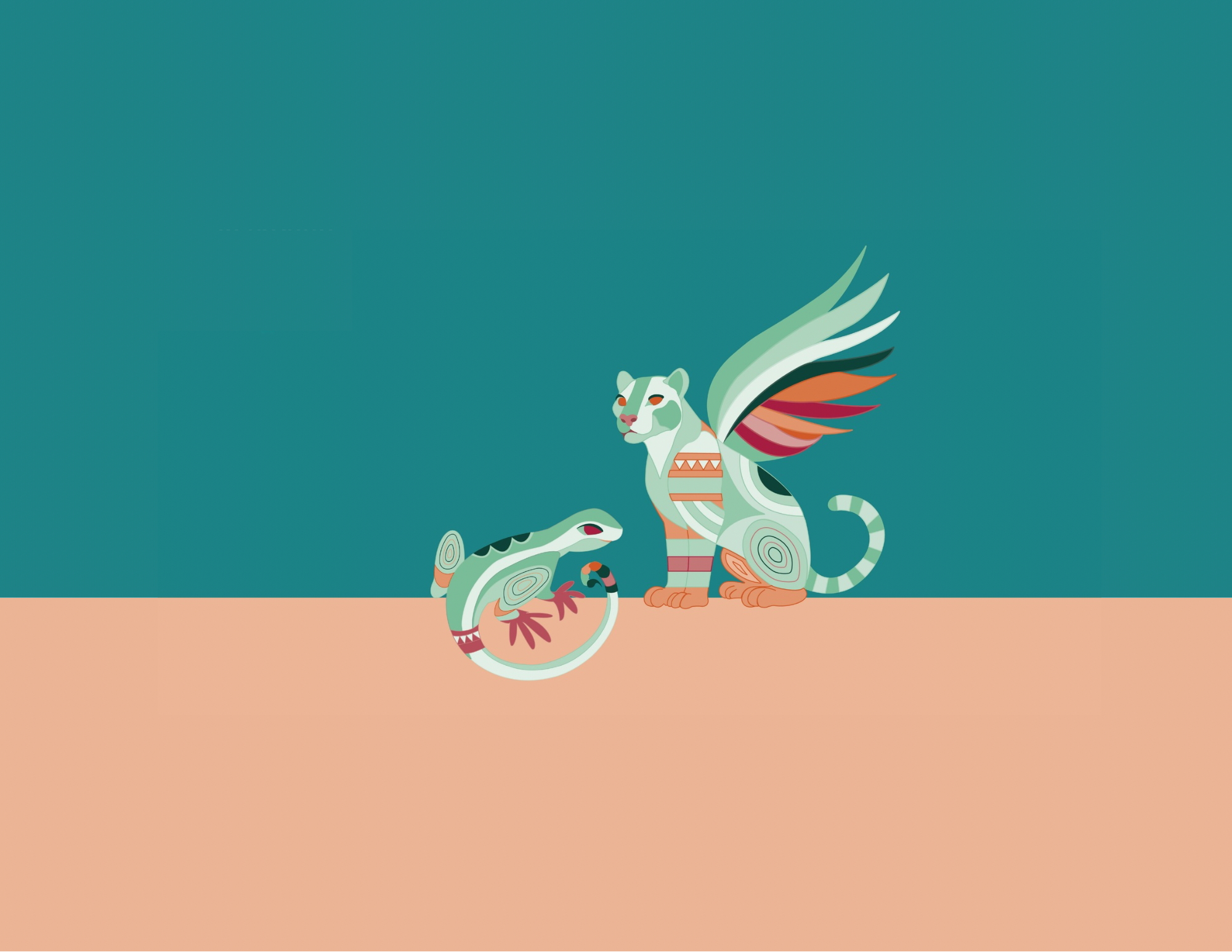
Tequila — La Pantera: a symbol of power, strength, and connection to the natural world. Honored by the Maya and Aztec as a god and symbol of leadership, it represents a force of nature.
Mezcal — La Iguana: A symbol of feminine strength, new beginnings, and good fortune. Those guided by the iguana are known for their energy, leadership, and ability to make things happen.
Logotype

Copy

Mexican culture and Alebrijes are known for their bold, vibrant colors. For El Alebrije, the palette was kept intentionally restrained, five main colors, each with shades and tints, to give the brand a modern feel while still honoring that cultural richness.
The two hero colors were chosen with each spirit in mind. Agave teal represents Tequila: it references the blue-grey tone of the agave azul plant, the main ingredient in tequila. Ember orange represents Mezcal: it reflects the smoky, earthy process of making it, roasting the agave over fire in Jalisco.
These two colors sit opposite each other on the color wheel, creating a strong contrast that makes both products easy to tell apart on a shelf. The deep green and dark crimson add depth and a sense of tradition without taking over.
The idea was simple, lots of color is expected from a Mexican brand, and by keeping it minimal and intentional, the brand feels sophisticated, but the soul is still very much there.


Two alebrijes—La Pantera for Tequila and La Iguana for Mezcal. These hand-drawn characters serve as the foundation of the brand, blending mythical storytelling with modern, geometric precision.
Packaging
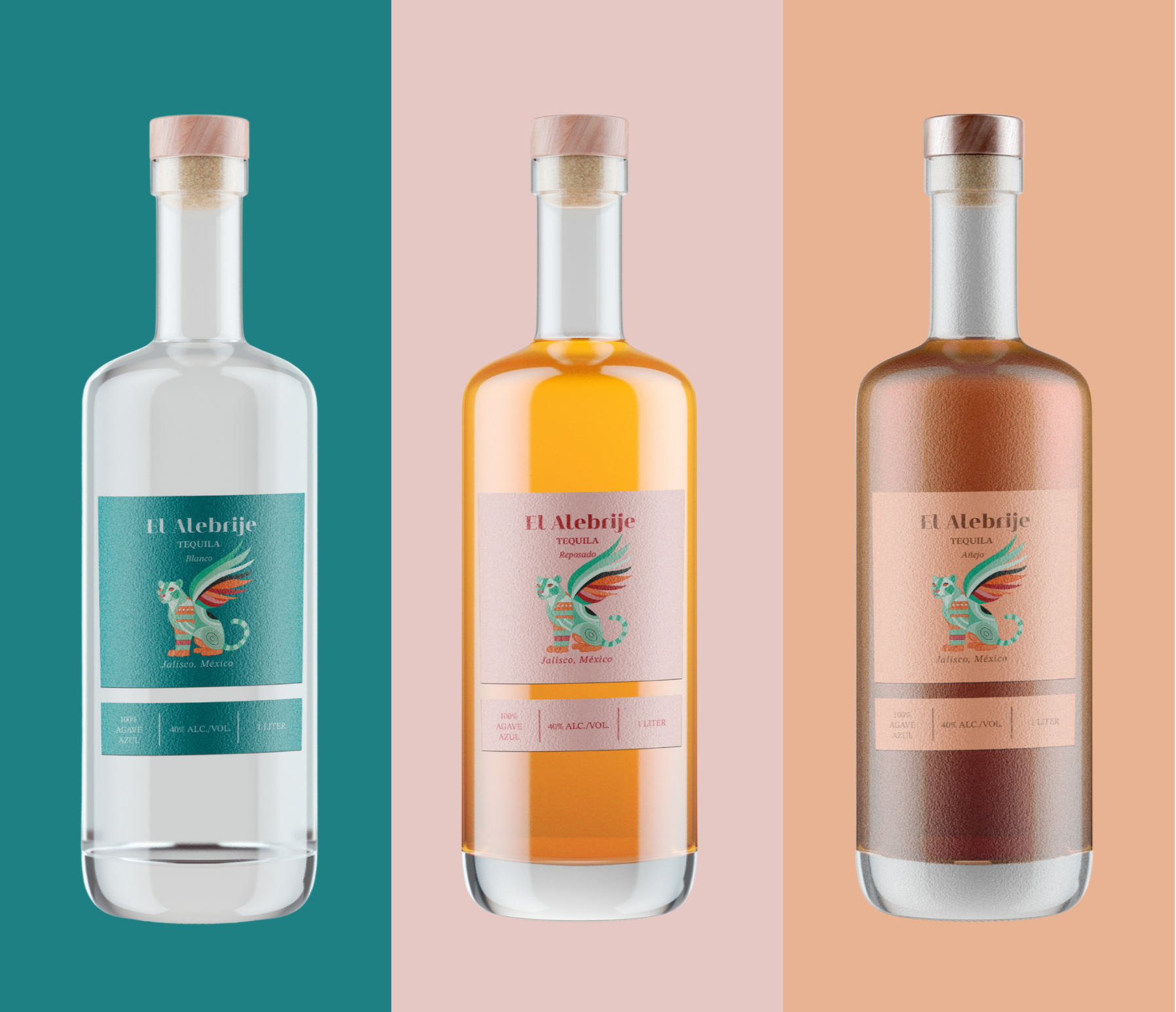

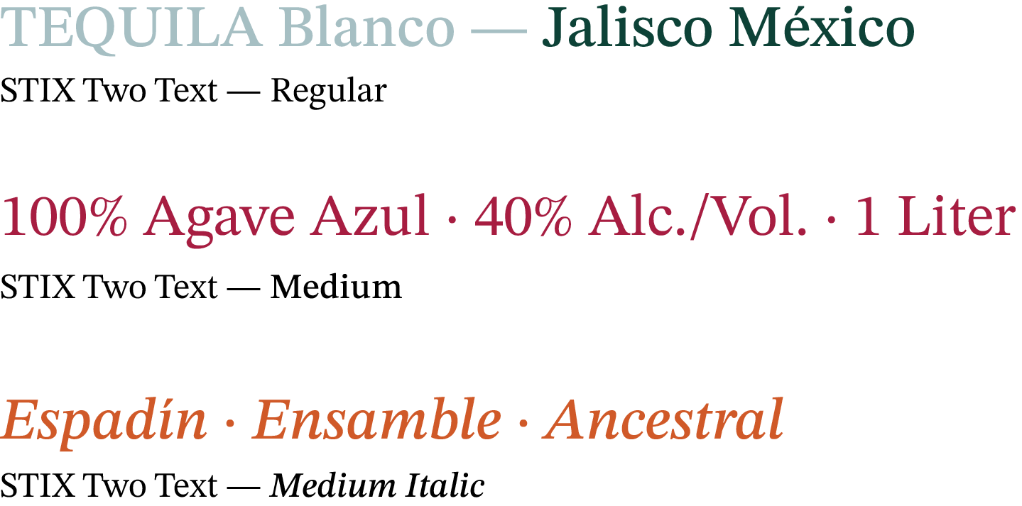
The labels use a minimal design to balance the complexity of the illustrations. The layout stays consistent across all variants, brand name, spirit type, origin, and the technical details at the bottom, but the background color shifts with each bottle. Each color was picked from the palette based on the character of that specific spirit. For example, teal for Tequila Blanco and light orange for Mezcal Ensamble. This way, every bottle feels like part of the same family while still having its own personality on the shelf."
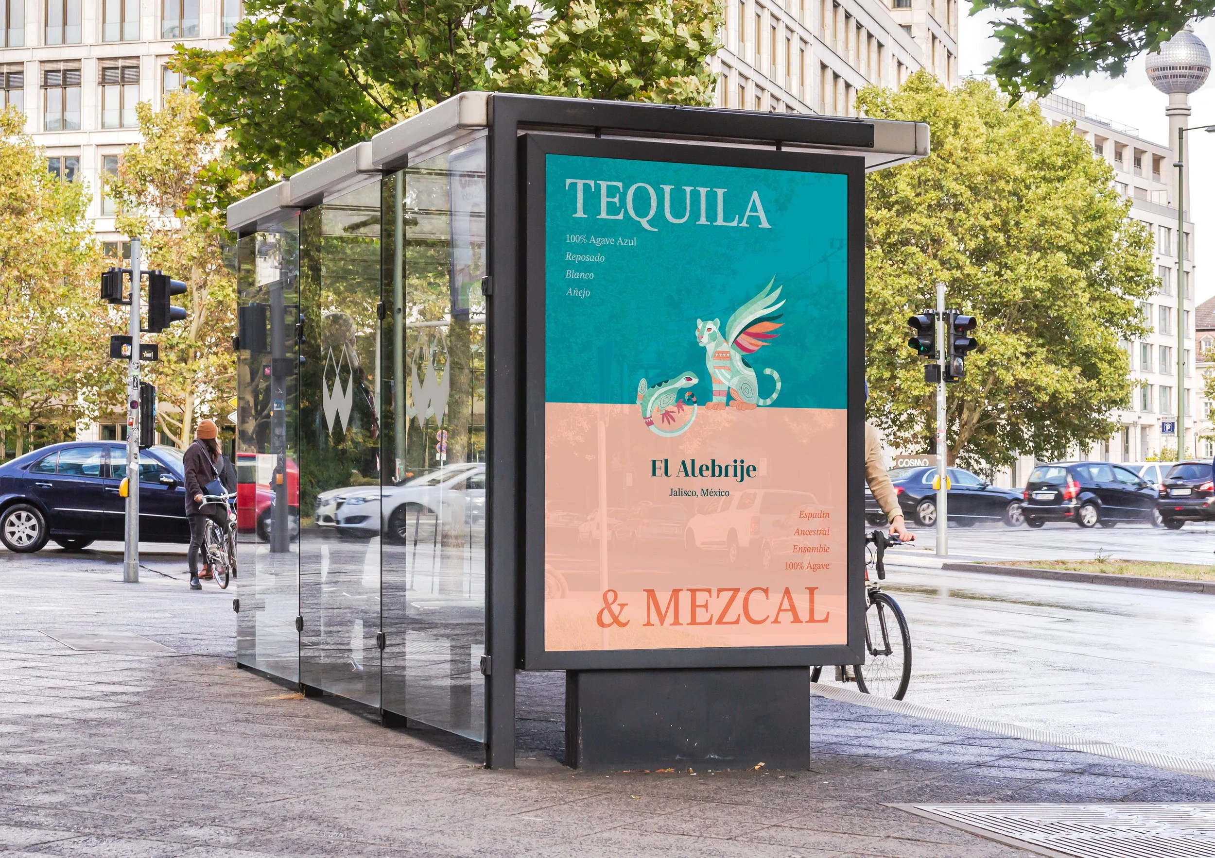
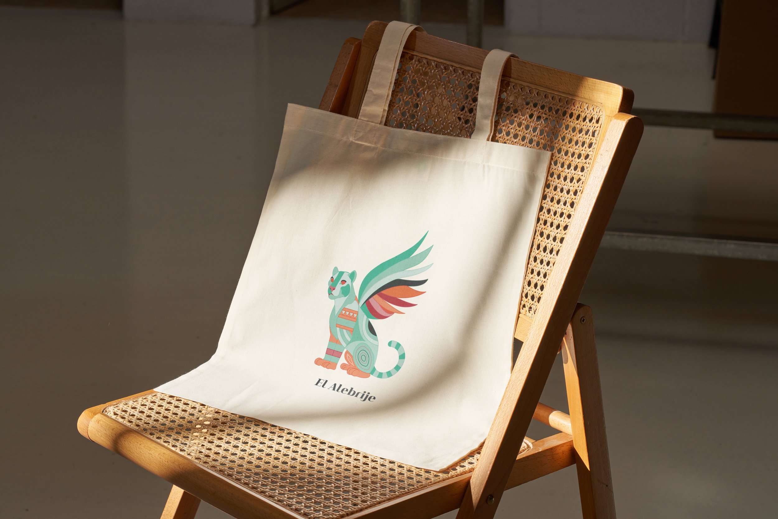
Brand Applications
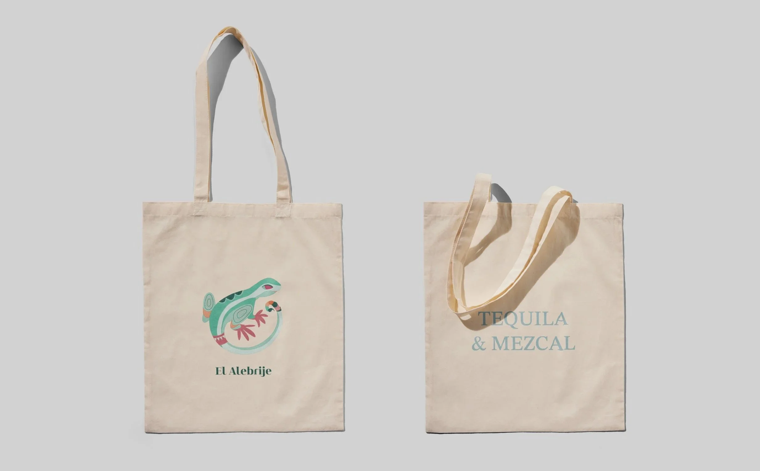
The visual system was tested across various scales, from tote bags to large-format outdoor advertising.