illumina | Las Flores
Brand Identity 3D Packaging Design Prototyping
Adobe Illustrator
Adobe Dimension
Adobe Photoshop
illumina is a lightingbulb brand created from scratch, along with its first special edition product line, Las Flores. The challenge was to give the brand a clean, modern identity while making each product feel unique through illustration. Instead of relying on the obvious — lightbulb shapes — each wattage was assigned a different flower, using the imagery to communicate the mood and intensity of the light.

The illumina Identity

The logo went through several rounds of sketches before being refined digitally. The focus was on keeping it clean and geometric, something that could hold its own against the richness of the packaging illustrations.
Logotype

Copy

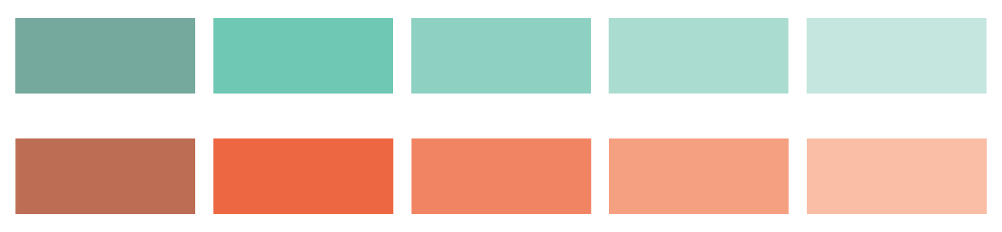
The palette is built around two main colors — a deep teal and a vibrant coral. The goal was to move away from the typical yellows and blues of the lighting industry and create something that felt more organic and fresh. Each color comes with one shade and three tints, which gave enough range to build depth and shadow within the floral illustrations without needing to introduce new colors.

Product Application
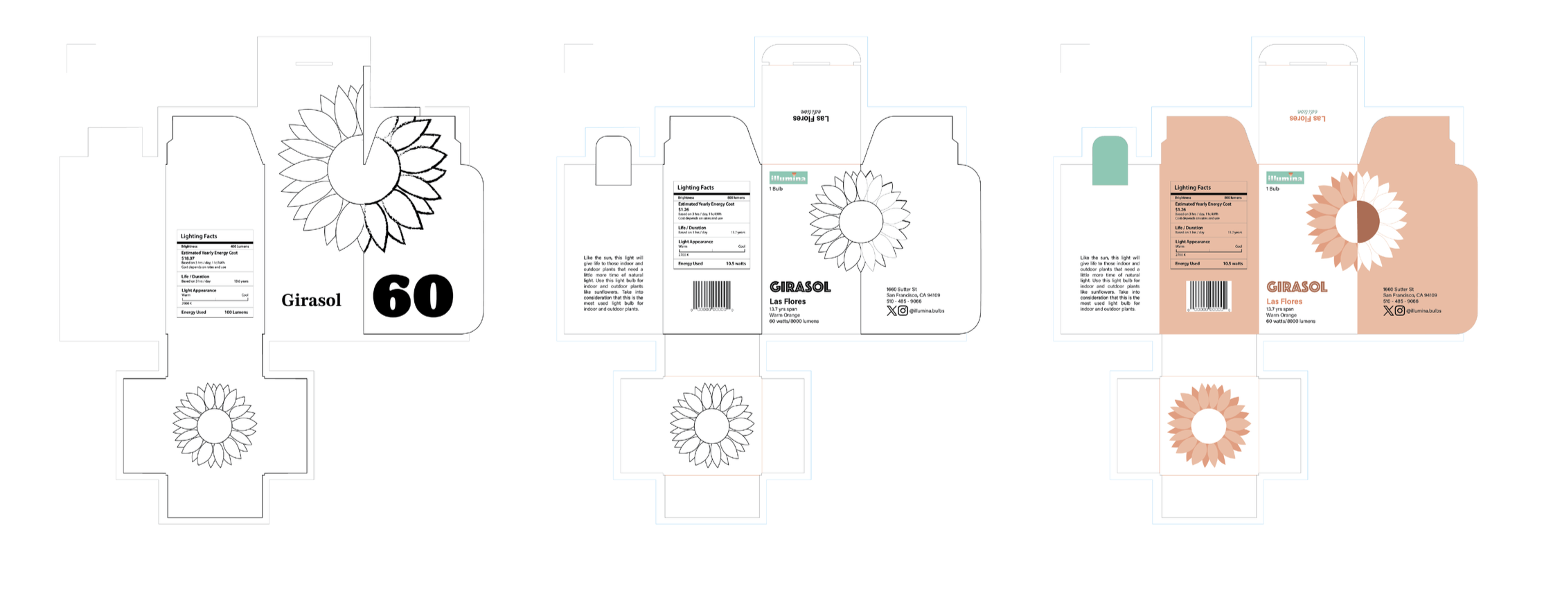
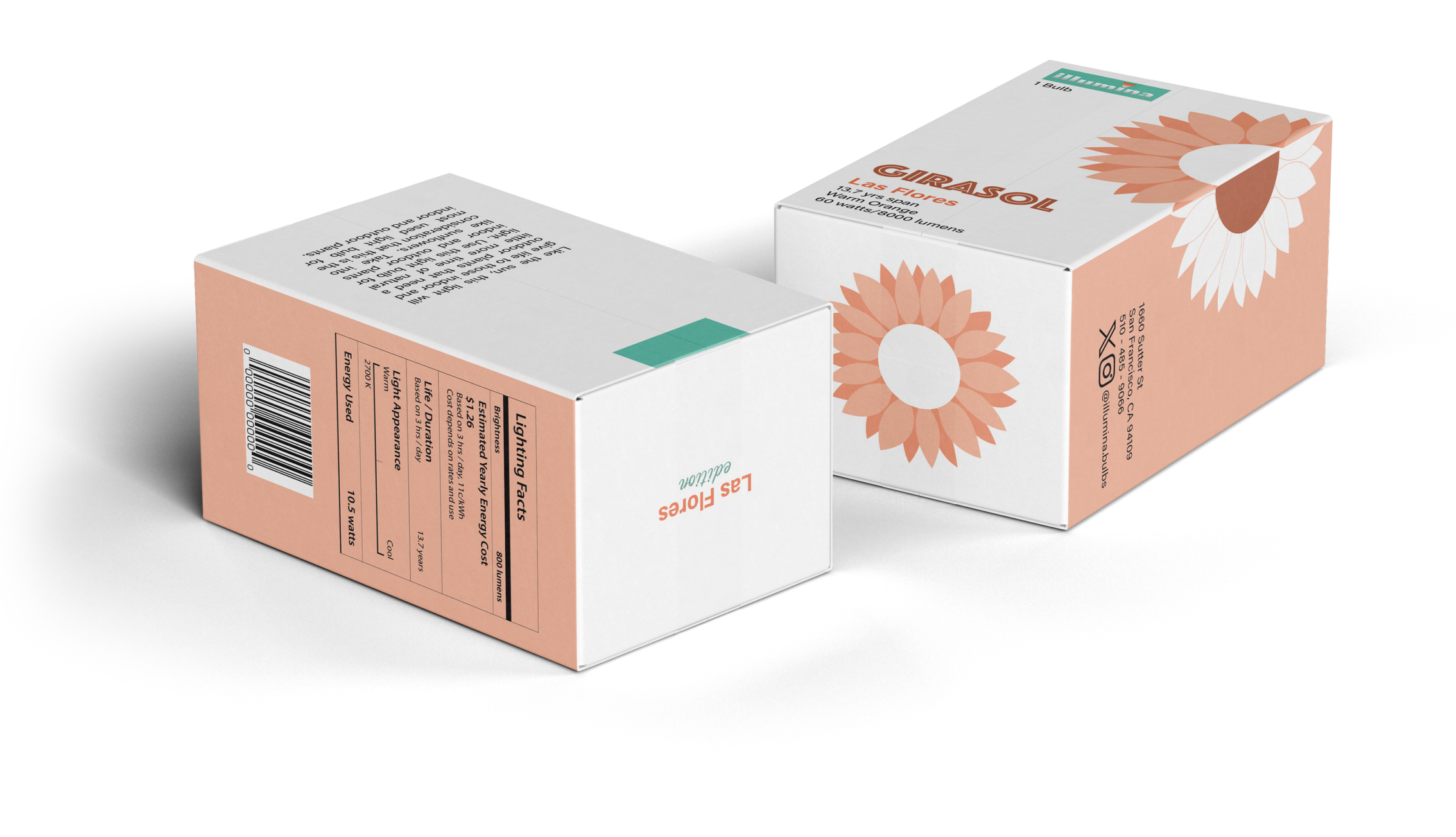
Girasol | 60 Watts
Everyday & General Lighting
As the standard bulb, the Girasol theme signifies clarity and natural energy. The radiating petals of the sunflower mimic the even dispersion of light, making it the perfect visual metaphor for everyday tasks and general household lighting.

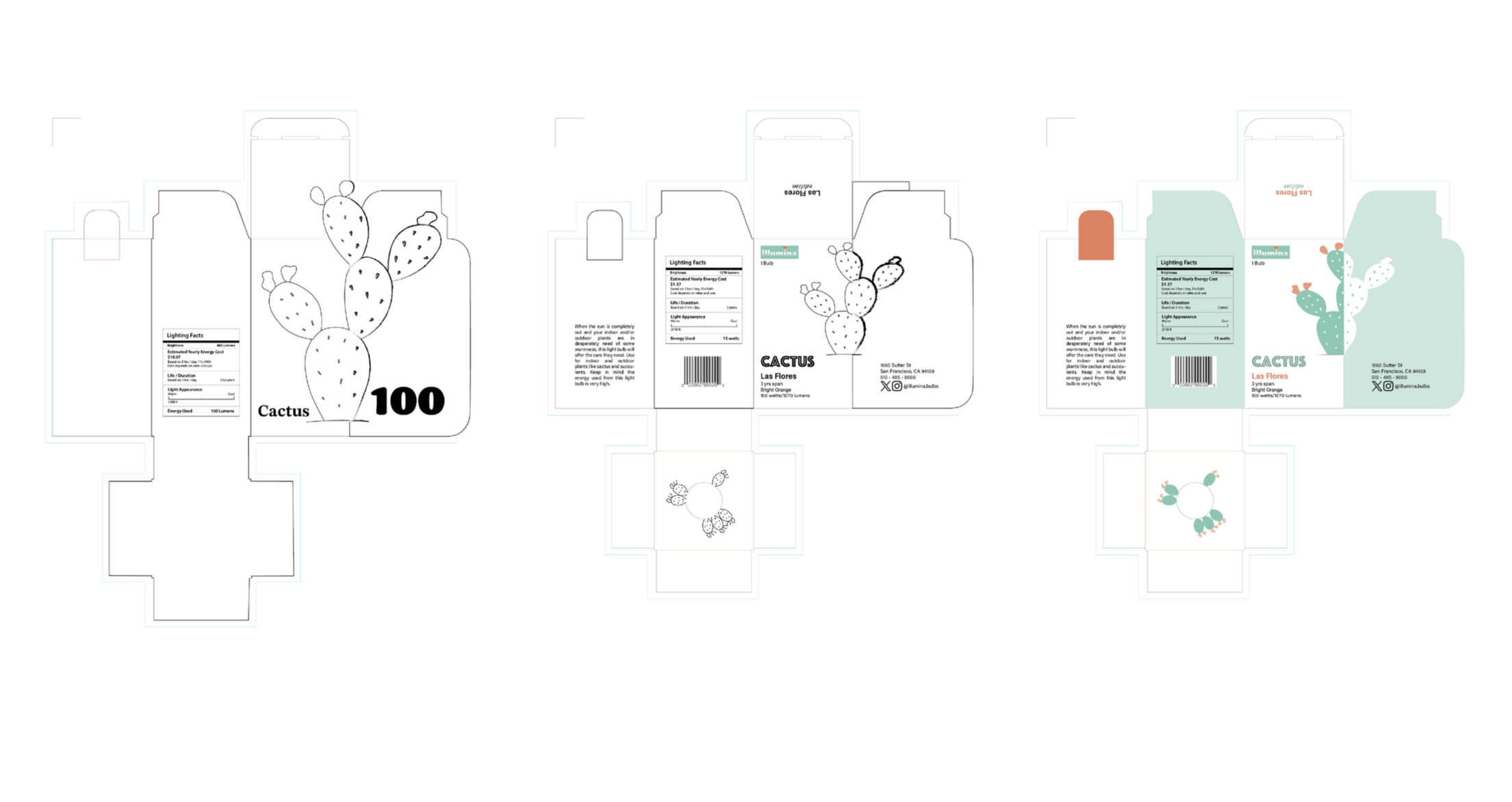
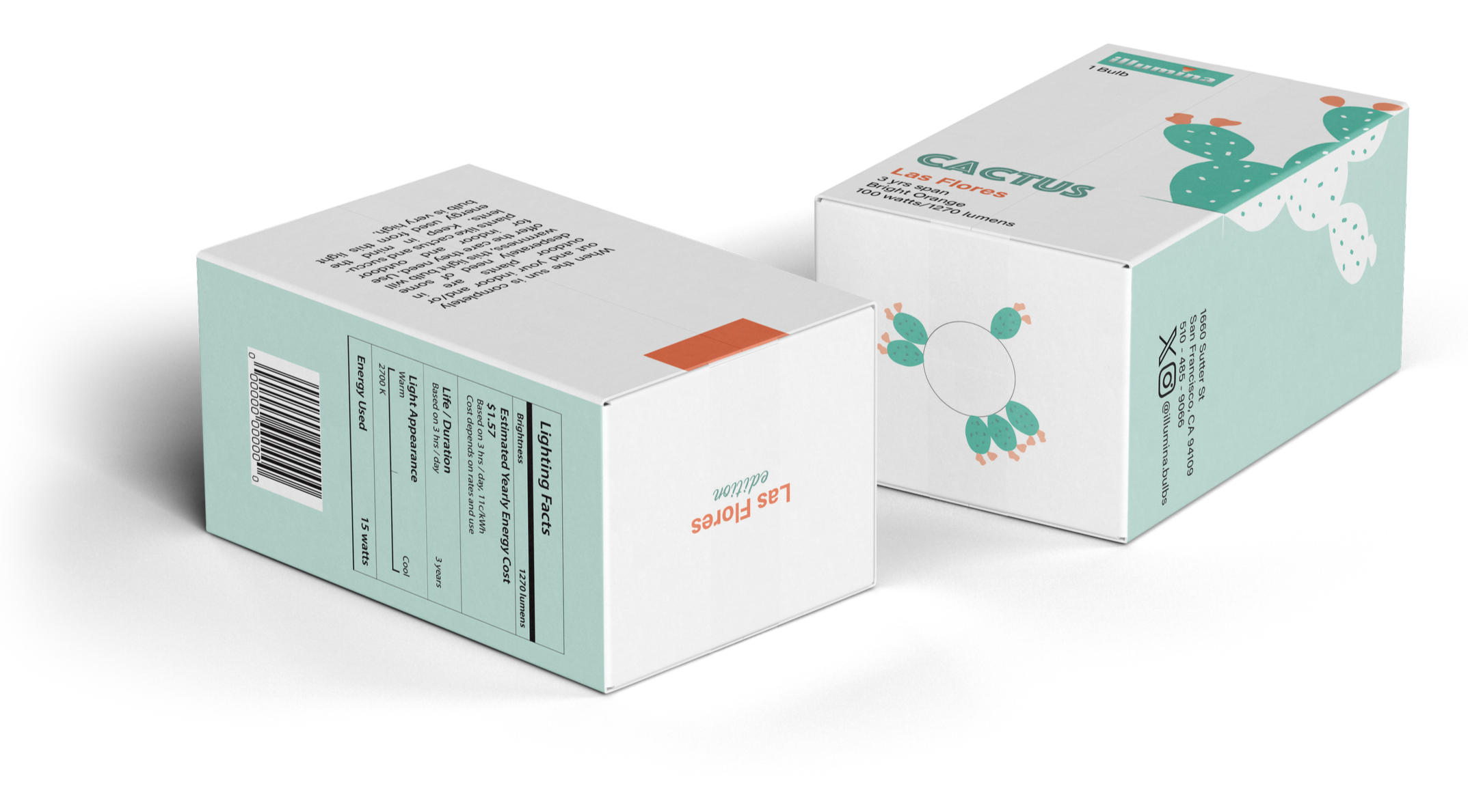
Cactus | 100 Watts
High Intensity & Functional Lighting
The Cactus theme is assigned to the highest wattage. The bold, sturdy forms of the desert flora represent resilience and high-output performance. Using the primary teal palette, this design suggests a powerful, long-lasting light source capable of illuminating large spaces or high-activity areas.

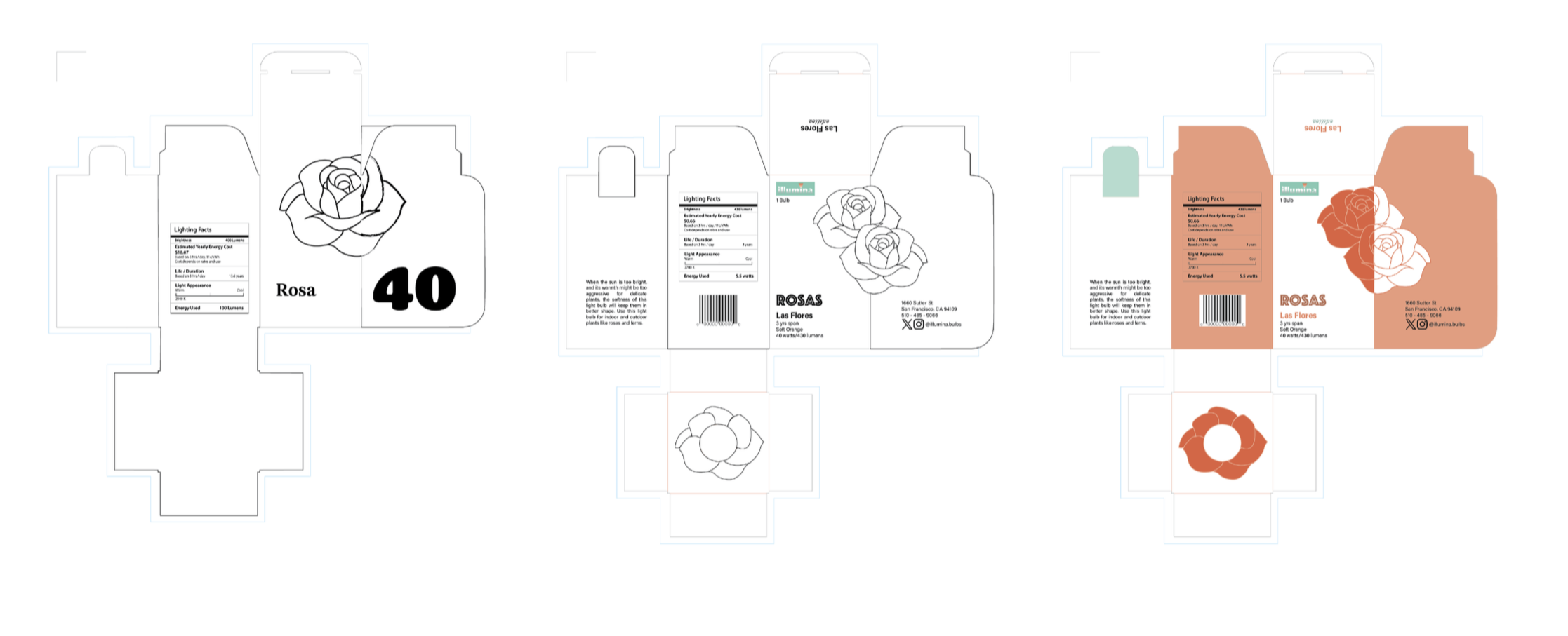
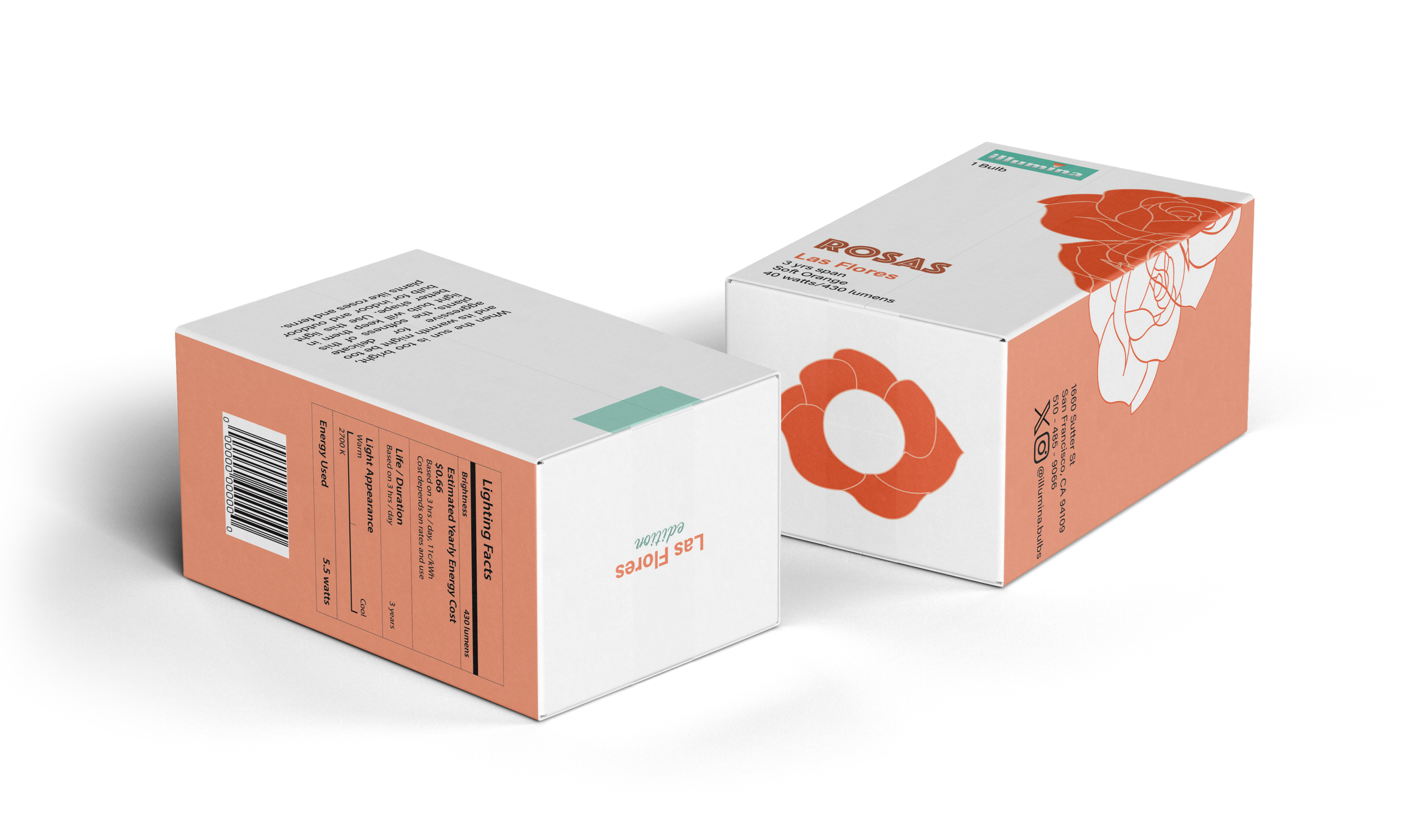
Rosas | 40 Watts
Mood & Ambient Lighting
The Rosas theme represents the softest wattage in the series. The intricate, delicate layers of the rose petals evoke a sense of warmth and intimacy, signaling a gentle glow. This visual choice suggests the ‘mood lighting’ typically used for relaxation or accentuating a space without overwhelming it.